Thanks for the help. I read the documentation a lot, but I’m bound to miss some stuff here and there.
I updated that last post, with a suggestion about how you architect your games and experiments.
That’s definitely a useful approach, creating the scene elements in different modules(s) and then make the main scene file only handle the interactions between them.
Heeeeey, don’t twist the camera, do it as it must be done ))) Here is your world without this type of magic, just look inside zip-file I prepared for you at google disk! And look this graphical approach to render your game animations. (Look carefully and you will understand how easy you can do what you need without any dancing, just painting)
https://drive.google.com/open?id=1V93aATpKvBBwhKW03IoaUgEOYGkvHIfr
![]()
I mean don’t try to twist your scene to be isometric, just load all the graphic that already is isometric. Diablo II was one of most successfull isometric games (also with pseudo-perspective) with pre-rendered word. There are some secret free resources with high quality characters with animations that you can render (i.e. 3D Max Studio) with shadows and light and opacity.
Here you can grab trees: https://opengameart.org/content/tree-collection-v26-bleeds-game-art
Example 
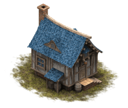
Here you can grab 16-directions rendered house: https://opengameart.org/content/timbered-house
example 
When I first started looking at isometric I intended to do the same as you - rotate and squash regular square images to automagically create isometric views of them, but I found it was a terrible idea in reality. One major issue being that this approach would only allow completely flat tiles - you couldn’t have any vertical overlap like buildings or grassy areas.
You’re much, much better off pre-rendering your graphics and positioning them in an isometric layout. We found that the best way to produce isometric graphics is to create (or source) 3D models and take renders of those models at each appropriate angle to create spritesheets. For this we chose Blender. We basically positioned and configered a camera to take perfectly isometric render of a small plane, giving us 256x512px canvases with that plane at the very bottom of the canvas, sitting edge to edge and basically squashed 2x1. Then we created an animation sequence to rotate that plane by 45 degrees across an 8 frame sequence, resulting in 8 rendered isometric sprites.
Now when we need to render new assets, we create models as usual, and then simply import them into this rig for rendering. Positioning the imported model above the plane and attaching it so that the plane is the parent causes the whole model to render inside that 256x512 canvas and from all 8 angles. Because the plane is rotating instead of the camera moving, the lighting set-up remains fixed which keeps shadows in the right place when for example your character turns around. Finally if we’re rendering something like a wall, which has to tile nicely, we just disable anti-aliasing for that render to get the nice 80s pixelation that tiles so neatly.
We then collate the renders into a single spritesheet using Gimp (slightly quicker than Photoshop for this, apparently). Just create a grid of guides, then File -> “Open as layers” to select all 8 renders, and then drag each of the created layers to an appropriate grid location. If your renders only use up a small amount of the vertical canvas space, just create the guides closer together to crop that space out.
I’ve attached our Blender rig for you - hopefully the above makes sense and this saves you some time creating suitable sprites. Honestly, graphic assets are the most time consuming aspect of isometric games it seems.
Finally, please consider our Qiso plugin for the remaining gruntwork: https://marketplace.coronalabs.com/corona-plugins/qiso-isometric-tilemap-engine
Qiso imports isometric Tiled maps, lets you manipulate tiles on the fly, and has built in A* path-finding. There are sample maps, sprites, codes and video demos at https://qiso.qweb.co.uk
Nice work on your isometric engine, if I come up with an isometric project I will be happy to give it a try!
Thanks Greg =).
I don’t want to steal focus from the original topic here, but please do get in touch when you get stuck in if you have feedback or need a hand.
Also Roaminggamer advised me to use TexturePacker or same utility to assemble many frames into one big spritesheet. Gimp combines all the frames into one spritesheet with a lot of free space and this spritesheet becomes very heavy, very huge in width and height while you need smaller texture size to load on mobile devices.
Using layers and coordinates (on isometric map) of your character you can make char or some building or tree overlapping each other to achieve better look.
Using matte/shadow material you can render your 3D models with semitransparent shadow. You MUST have and use shadows, this is 50% of successfull view.
With mathematical arctangent function you can find the rotation angle based on the coordinates of the cursor and your sprite, so you know in which sector of screen your cursor is relatively to sprite. With this angle you know what pre-rendered direction of char and opposite for monster to use to make them look one at other.
I want to make an isometric game and I have some experience and resources but first I need to learn corona api.
One great example you can see at flarerpg.org (there you can quickly notice all ideas and all flaws to make your best)
As I see topicstarter dissapeared, but this may be useful for others ))
That’s a fantastic idea! You’d need to render character heads at a lot of different angles for this to be effective but you could do that separately and then position the head sprite over the top of the rest of the character to negate the need for rendering absolutely tonnes of frames per animation, but I don’t think that’s an unfeasible amount of work and the result would be brilliant. I can’t recall seeing this in any of the isometric games I’ve played either - only isometric style games built in 3D engines where rotation is much simpler to control.
I’m less of a fan of texture packers than most, simply because Tiled doesn’t support differently sized frames in any one sheet and is too good of an editor to miss out on for the sake of slightly smaller spritesheets.
Subject to file type of course, generally the size of a raster image file is dependant on both canvas size and colour palette. In terms of colour palettes, lossless compression usually works by stripping the unused colours out of the palette and lossy compression works by replacing similar colours to reduce the palette further at the cost of a potentially noticeable change in quality. There are other factors and compression methods depending on the exact file format - I’m just talking bitmap data here - but you get the idea. Point being, you can actually produce fairly reasonably sized images with minimal loss in quality, if any at all, just by being careful with the number of colours you use and how you save them out. I personally find that Gimp on GNU/Linux just naturally produces smaller jpg/png files than either Photoshop or Gimp on Windows - presumably because the GNU image libraries for those formats are just better optimised than on Windows. I also find switching to an indexed colour palette before saving as either gif or png in Gimp reduces the output file even further and with less of an impact on quality than if you let the save process do that for you.
What I then tend to do for both my own sanity and to reduce the amount of wasted canvas space without resorting to texture packers, is simply categorise my sprites into different sheets. Characters being the most obvious - if you have 24 frames of the same character, chances are those frames are all going to be roughly the same size so drop them into a neat canvas of equal frame sizes that’s just big enough for the biggest of those 24 renders. Stick all walls in another canvas, all fences in another, and so on. It’s easier to manage assets if they’re categorised like this rather than just packed into any canvas space that they fit, you’re wasting minimal space by not dropping small fences into a grid designed for large walls, and you’ll be able to use Tiled!
in 3D engines where rotation is much simpler to control
Maybe functions I described above were built-in to this engine, but in middle ages, when engines were simpler, we wrote those controllers by ourselves. Also in 3D FPS game if you need to control weapon, you need to rotate it with camera using common ring formula:
WeaponModel.x = Player.x + Sin(Player.xAngle) x Radius // radius is distance from char to weapon
WeaponModel.y = Player.y + Cos(Player.xAngle) x Radius
Sine increasing, Cos decreasing, both provide a perfect arc. Increasing angle from zero to 360 you get perfect circle.
Here you can use this formula to create, in example, particle blows, like NOVA magic, or a guardrail, like FrozenArmor in Diablo II.
Here is an example of char I rendered few weeks ago (if you need I will give you 3D Max model, it’s animated)

P.S. Saving in PNG with optimized pallete is better quality than same gif
P.P.S Do not ignore packers: (each frame is 512x512)
You just drop all sprites you need. In your example you just drop both big and small fences or walls, 5-10-50 quantity, packer will optimize all the space, it will place small one close to big one, and if there will remain some space it will place another one and another one and so on.
Sorry, I don’t learned english in the school, but I think you are able to understand my thoughts ))))
The only 3D I’ve done to date was in Blitz3D over a decade ago, and BlitzMax with the MiniB3D library a little after that. In those, you created objects by calling something like newCube(), newSphere(), newMesh() etc (It’s been a while, these functions might not be exactly right) and what they generated was called an ‘entity’. Entities could then be positioned, moved (transitioned between positions), or rotated by setting x,y,z properties, and scaled by setting a scale exactly like how Corona handles scaling.
Behind the scenes the engine of course used cos/sin math to reposition the vertices of those objects for rendering, but as a developer you didn’t need to understand that. Simply create a basic shape or load a model mesh file and pass rotate() calls to it. In that respect, 3D is MUCH simpler for things like character rotation than isometric is because we don’t have to render and code in a whole bunch of spritesheets, and the result is of course much smoother because vectors can be manipulated with basic math and without any loss in quality.
I’d love to build a 3D engine for Corona when Qiso has all of the features I want to give it, and I’d take a lot of inspiration from how B3D functions worked. It was exactly the right balance between not having to understand the inner workings of 3D rendering, and not using those awful drag-and-drop ‘programming’ engines like Unity.

