HELP HELP HELP :huh:
Please review this doc and pay close attention to the talk about content scaling:
https://docs.coronalabs.com/guide/basics/configSettings/index.html#contentscaling
It looks like you’re using letterbox scaling and not making the background images large enough to cover bleed space (horizontal or vertical depending on device).
In my opinion, folks will give advice that is wildly too complicated for new developers to grok when they first encounter this topic.
I suggest:
-
Use this basic config.lua file:
application = { content = { width = 640, height = 960, scale = “letterbox”, }, }
-
Make your background images all be:
- 760 x 1140
- centered on the screen
This way, no matter what device you play the game on, that image will always fill the screen.
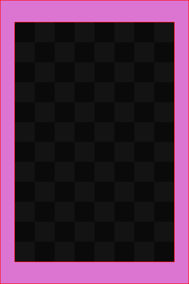
This is a prototype background below. Your artwork should be the same size as this and fill the whole space.

(The grid area is guaranteed to display on all devices. It should contain the most important parts of your visuals)
(The pink area is bleed. This is not going to be visible to all players, so don’t put critical element in this.)
Later…
Once you understand this, you will next have to learn about discovering/calculating the current device’s left,right,top, and bottom screen edges so you can align critical GUI elements relative to these instead of simply placing them in fixed positions.
romainggamer’s advice is solid but I would like to add another possible setup for you.
You can use zoomEven and this will ensure either the full width or full height is used without any disproportional scaling. If your game will work with some edge bleed then this is an option too.
This works best for games where you can pan and zoom the game world relative to the display, think Clash of Clan type games. If your game has a fixed like Candy Crush then do as romainggamer advised.
application = { content = { width = 480, height = 800, scale = "zoomEven" } }
You will still need to use relative positioning for UI elements to cope with wildly different screen dimensions when comparing Android to iPad.
It’s also important to understand that 0, 0 and display.contentWidth, display.contentHeight are the corners of the value you set in config.lua. Thus using 640 and 960 letterbox on an iPhone 5 which is 640 x 1136 and assuming you are leaving the positioning centered, then 0, 0 will actually be at 0, 88 on the physical device. The display.contentWidth, display.contentHeight will be at 640, 1048 while the physical bottom of the screen is 640, 1136.
This can be solved by a couple of minor changes. If you need to reference the bottom of the screen, you display.actualContentHeight to get the value. To get the actual right side of the screen (important on tablets which are typically more square), you use display.actualContentWidth instead of display.contentWidth.
Getting to the actual top left corner is a bit trickier. There are two values you can get: display.screenOriginX and display.screenOriginY. These will return the offset of the physical screen from the virtual content area you defined in config.lua. Continuing to use this example, display.screenOriginX will return 0 since the screen width matches the config.lua. But display.screenOriginY will return -88 since it’s 88 pixels above 0 on the screen. To position an object at the top of the screen, say 25 pixels from the top edge you would do:
myObject.y = 25 + display.screenOriginY
Want to place it 25 pixels from the physical bottom of the screen:
myObject.y = display.actualContentHeight - 25
Rob
Please do not hijack threads.
Thank you very much, I was having a lot of trouble understanding the scaling of screens. If I used the “Suffix image” could I reduce the pink margins in the screen scaling?
There are two different discussion points:
Content Scaling - The ability to let you define a grid system X points wide, Y points high that your app will use. Some common values people use are 320x480, 640x960, 800x1200 etc. Content Scaling maps your defined content area to the physical screen. If you define your content area as 320x480 but you’re on an iPhone 5 screen thats 640x1136, Corona will automatically convert your X, Y’s in your content area to X,Y’s for the device automatically so you don’t have to deal with a zillion different screen sizes.
From this content scaling, a scaling factor will be calculated. In the example above on an iPhone 5 with a 320x480 content area, it will be scaled by 2.0. An iPhone 6 is 750 x 1334. 750 / 320 = 2.34.
Now this does tie into Dynamic image sizes. You can set values in config.lua that lets Corona select higher resolution images instead of lower resolution images that have to be scaled up or down by large amounts. If you provide images that are higher resolution, Corona can automatically use the image that has to be scaled the least if you use display.newImageRect() or sprite sheets. display.newImage() isn’t affected by Dynamic images.
Please review this doc and pay close attention to the talk about content scaling:
https://docs.coronalabs.com/guide/basics/configSettings/index.html#contentscaling
It looks like you’re using letterbox scaling and not making the background images large enough to cover bleed space (horizontal or vertical depending on device).
In my opinion, folks will give advice that is wildly too complicated for new developers to grok when they first encounter this topic.
I suggest:
-
Use this basic config.lua file:
application = { content = { width = 640, height = 960, scale = “letterbox”, }, }
-
Make your background images all be:
- 760 x 1140
- centered on the screen
This way, no matter what device you play the game on, that image will always fill the screen.
This is a prototype background below. Your artwork should be the same size as this and fill the whole space.

(The grid area is guaranteed to display on all devices. It should contain the most important parts of your visuals)
(The pink area is bleed. This is not going to be visible to all players, so don’t put critical element in this.)
Later…
Once you understand this, you will next have to learn about discovering/calculating the current device’s left,right,top, and bottom screen edges so you can align critical GUI elements relative to these instead of simply placing them in fixed positions.
romainggamer’s advice is solid but I would like to add another possible setup for you.
You can use zoomEven and this will ensure either the full width or full height is used without any disproportional scaling. If your game will work with some edge bleed then this is an option too.
This works best for games where you can pan and zoom the game world relative to the display, think Clash of Clan type games. If your game has a fixed like Candy Crush then do as romainggamer advised.
application = { content = { width = 480, height = 800, scale = "zoomEven" } }
You will still need to use relative positioning for UI elements to cope with wildly different screen dimensions when comparing Android to iPad.
It’s also important to understand that 0, 0 and display.contentWidth, display.contentHeight are the corners of the value you set in config.lua. Thus using 640 and 960 letterbox on an iPhone 5 which is 640 x 1136 and assuming you are leaving the positioning centered, then 0, 0 will actually be at 0, 88 on the physical device. The display.contentWidth, display.contentHeight will be at 640, 1048 while the physical bottom of the screen is 640, 1136.
This can be solved by a couple of minor changes. If you need to reference the bottom of the screen, you display.actualContentHeight to get the value. To get the actual right side of the screen (important on tablets which are typically more square), you use display.actualContentWidth instead of display.contentWidth.
Getting to the actual top left corner is a bit trickier. There are two values you can get: display.screenOriginX and display.screenOriginY. These will return the offset of the physical screen from the virtual content area you defined in config.lua. Continuing to use this example, display.screenOriginX will return 0 since the screen width matches the config.lua. But display.screenOriginY will return -88 since it’s 88 pixels above 0 on the screen. To position an object at the top of the screen, say 25 pixels from the top edge you would do:
myObject.y = 25 + display.screenOriginY
Want to place it 25 pixels from the physical bottom of the screen:
myObject.y = display.actualContentHeight - 25
Rob
Please do not hijack threads.
Thank you very much, I was having a lot of trouble understanding the scaling of screens. If I used the “Suffix image” could I reduce the pink margins in the screen scaling?
There are two different discussion points:
Content Scaling - The ability to let you define a grid system X points wide, Y points high that your app will use. Some common values people use are 320x480, 640x960, 800x1200 etc. Content Scaling maps your defined content area to the physical screen. If you define your content area as 320x480 but you’re on an iPhone 5 screen thats 640x1136, Corona will automatically convert your X, Y’s in your content area to X,Y’s for the device automatically so you don’t have to deal with a zillion different screen sizes.
From this content scaling, a scaling factor will be calculated. In the example above on an iPhone 5 with a 320x480 content area, it will be scaled by 2.0. An iPhone 6 is 750 x 1334. 750 / 320 = 2.34.
Now this does tie into Dynamic image sizes. You can set values in config.lua that lets Corona select higher resolution images instead of lower resolution images that have to be scaled up or down by large amounts. If you provide images that are higher resolution, Corona can automatically use the image that has to be scaled the least if you use display.newImageRect() or sprite sheets. display.newImage() isn’t affected by Dynamic images.