config.lua - Fixed vs. Calculated Resolution

Hi folks.  I was answering a recent post where I made an assertion that “calculated config.lua resolutions are of no value, especially for new folks.”
 
Now, I still believe this, but I’d love to hear what others think.

(Also, I hate to put down or poo poo other folks’ work or even seem like I am.  So while I don’t use these myself, I really want to learn the value of them so I can correct my attitude. :slight_smile: )

 
What I mean by FIXED and CALCULATED
 
To be clear, here is what I mean by,
 
Fixed

application = { content = { width = 640, height = 960, scale = "letterbox", fps = 60, }, }

 
Calculated

(Just in case anyone decides to use this, I’ve modified it as per @davebollinger’s reply below.)

local aspectRatio = display.pixelHeight / display.pixelWidth application = { content = { fps = 60, -- WRONG width = aspectRatio \> 1.5 and 320 or math.ceil( 480 / aspectRatio ), -- WRONG height = aspectRatio \< 1.5 and 480 or math.ceil( 320 \* aspectRatio ), width = aspectRatio \> 1.5 and 320 or math.floor( 480 / aspectRatio ), -- BETTER height = aspectRatio \< 1.5 and 480 or math.floor( 320 \* aspectRatio ), -- BETTER scale = "letterbox", } }

 
Why I Like Fixed
A long time ago, I stumbled upon an blog post that talked about the ‘magic recipe’ for config.lua files and projects. 
 
It was essentially a fixed resolution config.lua file and a 570 x 380 background image. 
 
I use a modern version of this that works for all known devices, including the terrible/painful to deal with iPhone X.

protoBackX.png
 
The config.lua is the one I show above (fixed example) and the image is 720 x 1386.  I use this recipe for my askEd starter kit here: https://github.com/roaminggamer/RG_FreeStuff/raw/master/AskEd/askEdStarter.zip
 

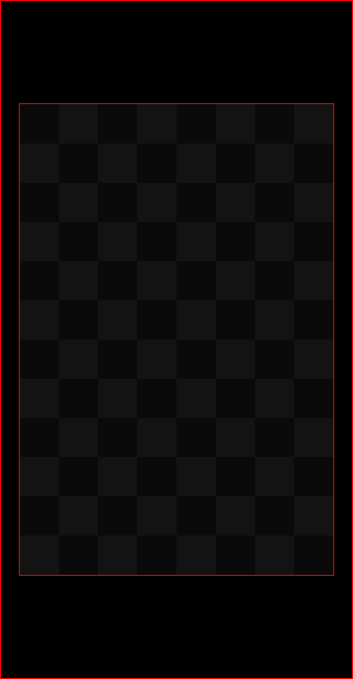
The image (as shown) has a wonderful guideline.  The checkerboard area is guaranteed to be visible on all screens.  The black area bounded by red rectangles is bleed space.  In short, if you want a full screen image as a background, you can use this template, then put the important parts of the image in the ‘guranteed’ space and the filler in the bleed.

Also, the image above, has a wonderful attribute that is easy to miss.  It is very high resolution, so it looks OK if you run it on higher-resolution screens.  However, it will always work and can be loaded on low-end devices that only have 2k x 2k texture buffers.  If you really need the @2x versions of these images, they will maintain their low-end backward compatibility while being very suitable for all modern devices.

Auto-Scaling

Because this fixed recipe is using letterbox scaling I am guaranteed that my images placed with newImageRect() (which I use almost exclusively) will automatically be scaled while maintaining the aspect ratio of my content.

What is not guaranteed is that things like. display.contentWidth, display.contentHeight, etc are the same.  i.e. 0 may be the left side of the screen on some devices and not on others.  So, how do I deal with that?

Relative Placement

In my designs, I typically use fixed sizes and relative placements for my interface elements (buttons, score labels, etc.). 

By relative, I mean “relative to the current device’s” left, top, right, bottom, full with, full height, centerX, and centerY.

If you know me, then you know I never code without SSK2.  SSK2 automaticall calculates these values for me and exposes them as globals: https://roaminggamer.github.io/RGDocs/pages/SSK2/globals/#global-variables

Planning Is Easier
At the end of the day, for me, the main reason fixed resolution config.lua  files are best is because I know, going in, exactly what my minimum and safe content area sizes will be and I can plan my art accordingly. 

For me, a non-artist, this is a major plus. 

Also, it makes doing in-the head continuations while planning a game layout a snap.
 
 
Calculated Config.lua Files I Do Like
There is one calculated, config.lua file I do like.  Sergey Lerg’s Smart Pixel / Pixel Perfect config.lua
 
https://github.com/Lerg/smartpixel-config-lua
 
It fixes the image rounding issue/artifact problem seen when scaling goes wrong and a pixel in the original design ends up being some value plus a sub-pixel.  Ex: 1 becomes 0.45, 2 becomes 0.9, or the other way, 1 becomes 1.75, 2 becomes 3.5, etc.
 
Ideally a 1 pixel object in the original design would be an integer multiple of the original size.  This config.lua recipe ensures that.
 

-- Author: Lerg - spiralcodestudio.com -- GitHub: https://github.com/Lerg/smartpixel-config-lua -- SmartPixel config.lua -- Uses pixel perfect content scaling when possible local w, h = display.pixelWidth, display.pixelHeight local modes = {1, 1.5, 2, 3, 4, 6, 8} -- Scaling factors to try local contentW, contentH = 320, 480 -- Minimal size your content can fit in -- Try each mode and find the best one local \_w, \_h, \_m = w, h, 1 for i = 1, #modes do local m = modes[i] local lw, lh = w / m, h / m if lw \< contentW or lh \< contentH then break else \_w, \_h, \_m = lw, lh, m end end -- If scaling is not pixel perfect (between 1 and 2) - use letterbox if \_m \< 2 then local scale = math.max(contentW / w, contentH / h) \_w, \_h = w \* scale, h \* scale end application = { content = { width = \_w, height = \_h, scale = 'letterbox', fps = 60, imageSuffix = { ['@2x'] = 1.1, ['@4x'] = 2.1, } } }

IFF you decide to use a calculated config.lua, you MUST use math.floor not math.ceil if you want the result to work out properly.

consider a single calculated axis, height of a portait orientation, just to simplify, then try the following w both floor/ceil on a “weird aspect” device (16:9 works)

application = { content = { width = 320, height = math.floor(320 \* display.pixelHeight / display.pixelWidth), -- etc } }

you need to calc a value exactly equal or JUST LESS than actual height, so that width won’t become letterboxed.  (values in config.lua are integers, so round down, but display.actualContentHeight will reflect any resulting fractional excess at runtime)

if you instead use math.ceil then your content is fractionally TOO TALL for the device’s aspect ratio, so you’ll produce “half-that-fraction” letterboxes on the sides (which is supposedly what all of this was intended to avoid, but as written fails to!)

Since I’m kind of the quasi-creator of the variable config.lua (not the one most people use), my original use case was that on an iPhone I’d get a 320x480 and a 360x480 on an iPad and for Kindle Fire’s it would be something more fitting for the shape of the device and default to 320x570 for most android phones. This assured that 0,0 was the top left corner and display.contentWidth and display.contentHeight as the bottom right corner.  I lothed the idea of using display.contentOriginX and display.contentOriginY (I still do FWIW).  I was too lazy to type in display.actualContentWidth, display.actualContentHeight.

Even with this config.lua, you still have to use oversized backgrounds as in @roaminggamer’s reference to the magic formula. The key is to not build in artwork in the background image that shows where the score should go. These have to be separate design elements so they can be moved. Regardless of your config.lua this is important.

Now in my old age, I’ve changed my stand on the calculated config.lua and while there are still times that I think it’s the right choice, more often than not, it’s not that helpful.  Instead one should spend the effort to understand what config.lua is actually defining with regards to the content area and when it’s best to center that content area and when it’s best not to. 

How dependent is your app on accessing the center of the screen? Does your content need to flow from the top of the screen to the bottom (like many business apps)? Does your game need to play the exact same way across all devices (think Angry Birds where the sling shot and the pig tower have to be the exact same distance regardless of the device) or does it make more sense to spread your game objects out to take advantage of more real estate?

What might make more sense for your app is to change xAlign and yAlign to be “left” and “top” to get top, left to be 0, 0 and then just use display.actualContentWidth, Height to get the bottom right understanding that doing so will most likely change display.contentCenterX and display.contentCenterY to no longer be the center of the screen (you can simply use display.actualContentWidth / 2 to compute the new centerX.)

Today, I can’t really justify using a computed content area unless you’re planning to edge position or center position (some relative distance from center) all of your objects. I still don’t like having to add display.screenOriginX, Y to everything that gets edged positioned (even those right and bottom edged) objects. 

I think the main take away is there is no such thing as an ultimate config.lua and you need to think about what you’re doing instead of looking for a shortcut to avoid learning this very important part of your app’s configuration.

Rob

i otoh always use a calculated config.lua for my own work

but, i only ever calculate one axis.  fe, a portrait app might end up 320x426.6 on a 4:3 tablet, or 320x675.5 on a 16:9 phone.

tho i use 480 as my base rather than 320, such that my “native-size” assets (which are exported @2x to begin with, ie the “no suffix” version is twice intended content resolution) effectively assume a “@1.5X” role (ie @3x) by default (so that many times i only need that single set of images to adequately serve what would otherwise need separate @1x + @2x images (ie @2x and @4x

advantages:  origins are always zero, contentWidth = actualContentWidth = visibleContentWidth (and same for heights), contentCenterX/Y is always true center, only height ever varies so it’s easier to handle dynamic placement and android immersive - i just plan my vertical to fit 4:3 then “space it out more” on taller devices.

to each his own…  fe, with today’s displays, there are also strong arguments to be made in favor of just using something like 1280x720 with ‘standard’ letterboxing.     …unless you use certain widgets :frowning:

@davebollinger - When you say ‘for your own work’, can you give more specifics?

i.e Do you mean mostly games or business-apps or utility apps or all of these or something else entirely?

I mostly do games, but if I did apps I’d find having <0,0> always being the upper-left useful since (in my experience) business apps and such are typically widget heavy and most easily designed by anchoring elements based on their upper-left corner.

PS - Your point about to each his own is totally valid

The only time I’d (semi-) disagree is when giving advice to total newbs.  I find that the less they have to think about and figure out initially, the easier.  I frequently find they get totally confused about content space and scaling.

Thanks for replying!

@Rob - Thanks for the reply.  Like I said, I hate poo-pooing other folks designs and effort. 

I’m learning new things here, and while (begin a stick in the mud lazy programmer type) I’ll stick with fixed resolution designs, the feedback I’m seeing here is giving me things to think about.

Cheers!

PS - I’m so glad I’m not the only one who is too lazy to type in long variable names over and over to get things like actual width (fullw), actual height (fullh), centerX, centerY, left, right, …  :slight_smile:

@roaminggamer, but I’m too lazy to create local short variables…

FWIW, the 1.5x and 3.0x values in config.lua is another “Robism”.  But its one I’ll defend until the end.  We used to do 

 imageSuffix = { ['@2x'] = 2.0, ['@4x'] = 4.0, }

But if you have set your width to 320 and you’re on a 600 pixel wide device, like the original Kindle fire, 600/320 = 1.875 which picks up the 1x image even though that screen is very close to the 640 2X screen. Shouldn’t we be using the @2x image on a 600 px device?  As you do the math up to @4x, you end up excluding a lot of devices because 4.0 * 320 = 1280 which may be too big an image to load on an 800px wide device.  So by cutting that block back to:

 imageSuffix = { ['@2x'] = 1.5, ['@4x'] = 3.0, }

you get your break points at 480 and 960 which at the time fit much more comfortably.  With today’s higher resolution screens, changing the width and height probably makes more sense than monkeying around with the break points on when we choose to use the higher resolution images.

Rob

Hi RG,


First let me start by saying I enjoy reading your posts on various subjects.

Always learn something new.


Both these alternatives access the corona API (display), which is not recommended or at least officially supported.


I turned away from accessing the API in the config last year and got a setup which works so far, although I have only tested it using the adaptive scaling method, which works best for my current non-game app.


xAlign an yAlign are good parameters to use, as Rob pointed out.


Anaqim

I run everything centred and run landscape only.  I use

&nbsp; &nbsp; content = { &nbsp; &nbsp; &nbsp; &nbsp; width = 450, &nbsp; &nbsp; &nbsp; &nbsp; height = 800, &nbsp; &nbsp; &nbsp; &nbsp; scale = "letterbox", &nbsp; &nbsp; &nbsp; &nbsp; xAlign = "center", &nbsp; &nbsp; &nbsp; &nbsp; yAlign = "center", &nbsp; &nbsp; &nbsp; &nbsp; imageSuffix = { ["@2x"] = 1.25 } &nbsp; &nbsp; },

Which works great with 16:9 devices (no offsets and a canvas of 800,450) but supporting iPhoneX (canvas of 975, 450) and iPad is a challenge (canvas of 800,600).

Now my content is massive compared to canvas size so the only real issue is UI positioning.