Crossed Word Puzzles... released

Some time back, I undertook an exercise (which I should have long ago done and you should too).  I reviewed the top 100 games by category and tried to breakdown exactly what they were doing.  I was looking to understand how they were successful while also looking for a gap or niche that might be unfilled.
 
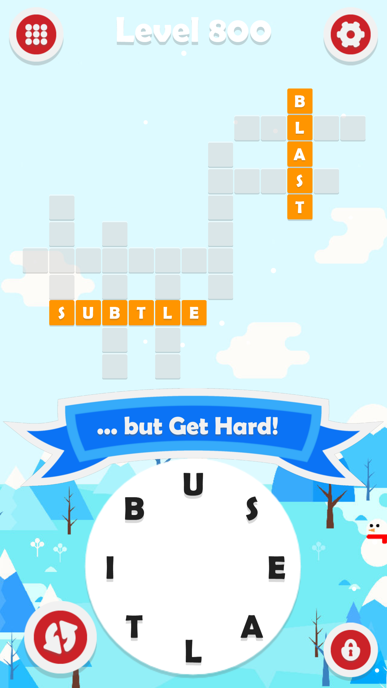
While doing so, I noticed a lot of activity and success in a particular genre: Swipe + Crossword puzzles like ‘Wordscapes’.  See how many there are?
 
I figured it was a fad that would die, so I continued on reviewing, reading, analyzing.
 
Then…a few days later, I circled back around and thought… “Hmmm, I wonder?  I wonder if there is any room in this space?”
 
Then I got serious and decided do try to model and improvethis game type.  
 
Today, I have completed and released on Android (and submitted for iOS) my take on this game style.
 
My version is much like the standard one, but I tried to ‘fix’ those things that users complained about in the other games.  As well I decided to completely skip certain parts:

  • No Ads
  • Just one IAP and not too expensive.
  • Few re-used words.
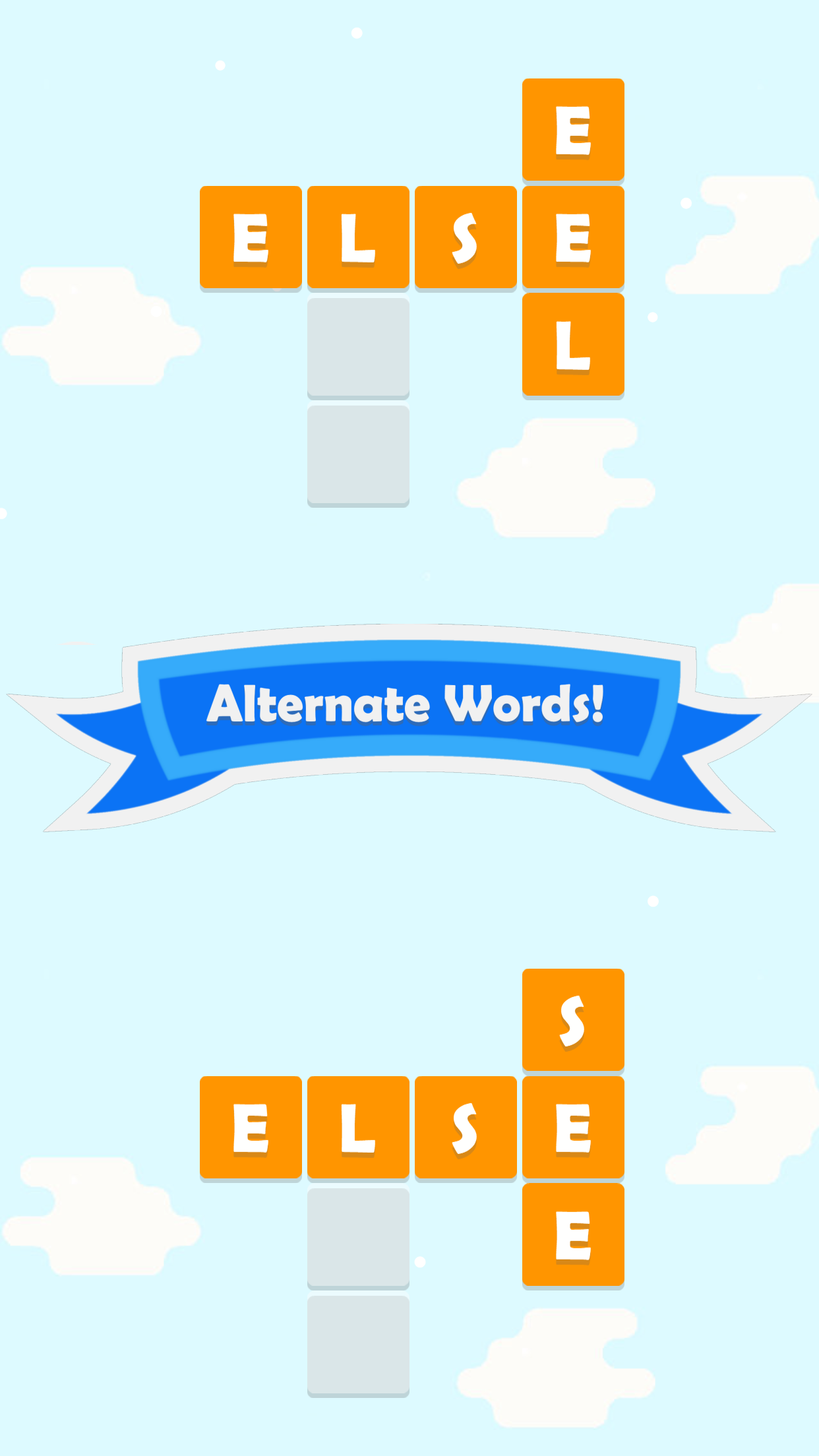
  • Allows alternate word choices as long as the choice doesn’t break other words in the puzzle.
  • Zen-ish fast play modes.
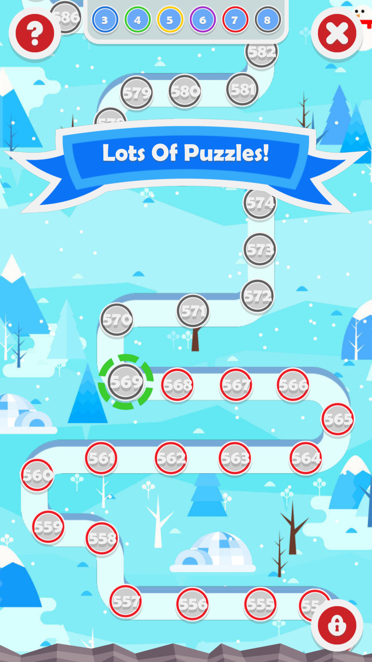
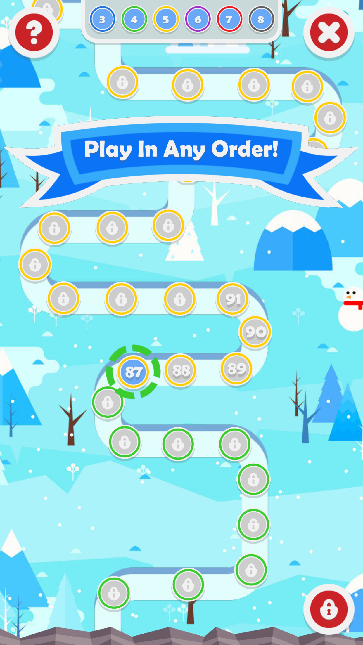
  • Your choice of play order (I played a few and really hated being limited to the one sequence of puzzles.)

  • Anyways, here is the Android Link: https://play.google.com/store/apps/details?id=com.roaminggamer.cwp
     
    I’ll post back when the Apple version goes live.
     
    Hey!  If you read this far, please consider downloading, playing, and reviewing the game.  It will help me a lot!
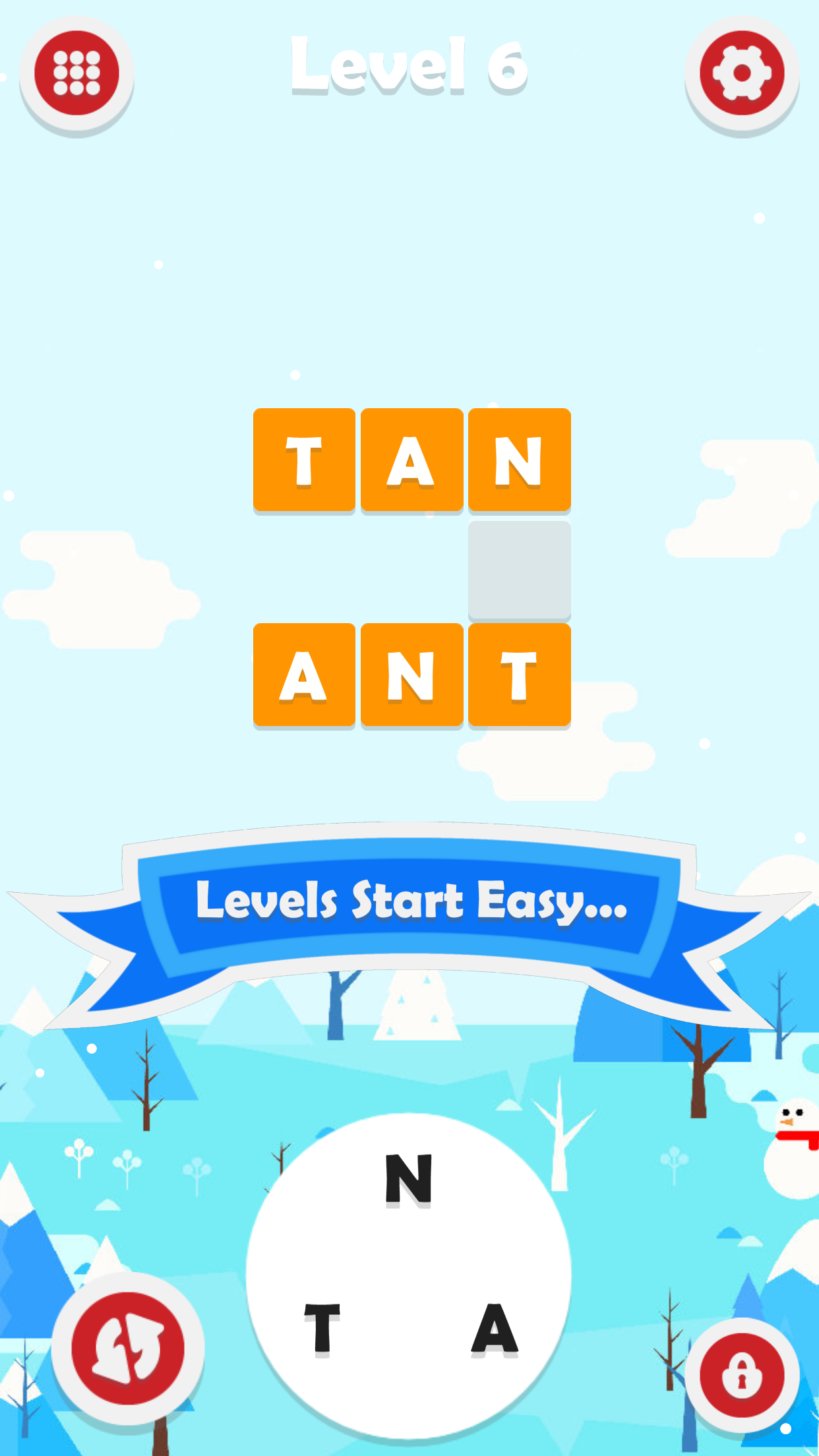
     
    1.png 2.png 3.png 4.png 5.png

Oh, one more note. I played around with a lot of ASO ideas for this. It feels and looks weird to me, but I’m doing my best to ignore my gut and instead take some advice from folks who have had success. Hopefully it turns out.

Pleased to see something of your own that isn’t a plugin, and both visually and as a concept, I like the look of this!

Downloaded and opened. My very, very first thought was “oh… no instructions?”. I’ve not played one of these before, and though it’s pretty obvious what to do once you start tapping things, it really needs an intro text ;-).

Plays very well after that, and feels polished.

My only criticism really, aside from needing an intro text, is that it takes a little too long to build up to the more difficult puzzles. Level 15 is the first to have a 4 letter word, and though the grids grow in word count until then, that actually decreases the difficulty because when you only have 3 letters to work with, a grid of 4 words means you’re pretty much inevitably going to find something with any combination of letters. I suppose how quickly a game progresses in difficulty is somewhat relative to the number of levels it has, but by 15 I’d like to have to be thinking a little…

Hope this comes across as constructive enough. Honestly, I’m more ‘trying’ to find fault than actually feeling that it’s defective, because I know you’ll be looking to improve where possible.

@richard11,

You’re right.  I should add a little mini-tutorial for new users.  

While I am primarily hoping to serve those familiar with this kind of game, I am aware I should also serve those who are not.

In fact, I planned to add a tip dialog on the first run that demonstrated how to swipe/play, but I deferred it in lieu of getting through the first approval on iTunes.

As is always the case, I’m sure to first add the feature to the Android version first since release are so… much faster on Google Play.

Looks great. I can’t wait to try it.

Little more feedback having played again this morning.

The dictionary is a little questionable. Words like aus and yrs have cropped up as answers for me now… Admittedly makes the levels much harder which is a good thing, but I could only find them by trying all the letter combinations… Perhaps that’s purposeful - again I’m not familiar with these games.

Following that, trying all combinations emphasized a bit of lag for me. You’ve to wait for the text effect from the previous attempt to complete before your swipe inputs are listened to again, which frustrates a little. If you just try really quickly swiping some words in you’ll see what I mean.

Great to see you’re developing games now - plays great and smooth and looks decently polished so far. I’m with Richard with regards to faster gameplay - you do have have an option to skip animations but to me, it feels much better if games just speed up transitions by a huge factor (like 5x or whatever feels good) when touching the display during a transition but also during any other delay caused by whatever timer is running.

I have no idea if this matters in any way, but given the name you’ve chosen does not include cross word puzzle, your game is not listed when I search for those words.

With a small tutorial I’d also move the user over to the level map after a few initial puzzles and also show/force them to play a puzzle of a higher level so they really know about this option.

I played it last night before going to bed. I have played the other game also and I like yours just the way it is. I don’t need a tutorial. I don’t find the transitions slow. Remember in whatever scape those transitions have at least a 30-second ad.  I also don’t mind the words this is better than always having to use the same 10 words. My complaints are trivial. I wish the platter or soup bowl or whatever you call it was bigger and I wish it had a less bright background so when I play in bed it doesn’t light up my face.

I had a long train ride today, so I gave your game a go and actually finished all of the free content. I might have to buy the rest for the holidays. :stuck_out_tongue:

All in all, it’s a good game with a lot going for it, but there are a few things that I thought could be improved.

Like many have already said, a brief interactive tutorial could be in order, though I don’t think that players familiar with the genre need one.

Then, as Richard pointed out, I think that the dictionary is questionable. Without any clues on what the words might be, I often resorted to brute forcing them. There are a lot of proper nouns, abbreviations and obscure words. I encountered words like: ANA, ALAN, ALA, CAS, NOS, ONS, CSS, CPU, VCR, GNU, UPC, COS, YRS, AUS and MOTOROLA. I love word games and puzzles, and whenever I solve (even by brute force) a difficult word, I get a kick out of it, but when I find out that the answer was something that I don’t know the meaning of even after googling it, I don’t get the same rush. I just get confused. :stuck_out_tongue:

Now, this suggestion may be a bit too late, but many similar games that I’ve played provide a category for every level. It also makes managing the difficulty level easier as guessing VCR becomes more reasonable if you know that the category is “video”. I’m also guessing that people who’ve been born a couple of years after I was don’t even know what a VCR is. :stuck_out_tongue: This way providing categories like “US states” or “brands” makes guessing Motorola more reasonable.

As for the audiovisual style, I liked the relaxed and calming theme, as well as the transitions. The art was, however, quite pixelated on my tablet. I’ve attached a screenshot of the game just in case (make sure to watch it at 100% zoom).

I found that the game had hints quite late as I was looking through the menus and the options just to see what you’ve done. Now, for the current monetisation method and its at times obscure words I feel that having the hints be free is quite fair, but many games that I’ve played have offered hints for watching an ad (or paying with in game currency). Watching an ad to reveal one letter’s locations on the level would have made my play experience a lot easier a lot sooner and I would have watched a few dozen at least. :smiley:

Finally, this might not be an issue, but after I completed all of the levels, the final level simply repeated. Same with other previous levels that I tried to replay afterwards. Adding a tiny notification whenever the player reaches and completes the last available level would be nice.

Now, I also have a few questions. Did you create all of those levels manually or did you generate them? Do you track player progression so that you know how many players you have at every step and if they are active so that you can plan future updates accordingly?

This looks fantastic @roaminggamer

This is the best criticism I’ve ever read, anywhere, of anything, ever.

At last a game! (sorry couldn’t resist dude)

Now about that marketing budget you are gonna need…  I know devs spending thousands a week on word games just to stay competitive.

Thanks for the feedback. 

  1. I’ll add a dimming mode.

  2. Also, I can adjust the size of the input circle. 

Can you remember, was it too small in all cases or just 3 and 4 letter cases (which are smaller input areas to allow for bigger puzzle space)?

Actually, the platter might be only small on the lower levels. I forget what level I am now but it does seem bigger.

  1. Do you think I should speed up the transitions even more in ‘fast play’ mode or both modes?

  2. re: cross word puzzle.  Yeah, I’m still working on the ASO balance.  My research showed a high search hit for the title terms and early description terms.  I did add the word crossword, but forgot the separated terms ‘cross word puzzle’.  ASO, marketting, ahhh!..  :unsure:

Oh, for the days when you could just make the game and sell it directly.  :slight_smile:

  1. re: pushing players to play higher levels.  Good idea.

I made the white platter small on 3 and 4 while maintaining the size of the letter circles, but it might be easier and juicier to make the letter circles bigger in the early levels.  This will actually help new users with accuracy of swipes before they get better at the motion.

_re: ‘at last a game!’ - _Oh!  I’m wounded.  (Not really.) 

re: marketing - Yeah, if I had two nickels to rub together I’d probably do some paid marketing.  I may still, but that is a whole new level of learning.   Still I totally hear  you on this.

If you intend to do any UA then PM me on slack and I’ll try and help you avoid the pitfalls mate.

I think the speed is fine in the regular mode for users playing in a chilled way. Also it’s probably less of an issue once you reach the harder levels. I just think one should be able to skip/speedup delays/animations on touch/click - like f.i. I hate it if PC games have complex and long animations in their UI and you can’t skip them f.i. when going back from a nested submenu level.

One more bit of unsolicited feedback: when I press to view the credits, I expect to find the name(s) of the developer(s) there. It feels odd not to be able to find a single mention of you, the person who probably did 99.99% of the work on the app, listed in there.