Difference in color between simulator and build (device, html5 build as well)

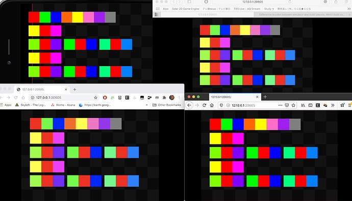
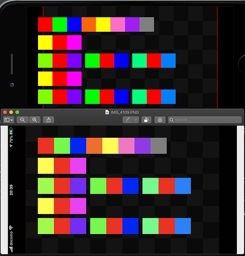
Hi! I’ve found something strange. I’ve always assumed, that the color calibration of different devices is different, so the colors I see in the simulator are slightly different from the ones on the actual device (iPhone, iPad, etc). However, today I built my project for HTML5 and put the browser window side by side with the simulator. Clearly the colors are different, even though it is on the same device (MacBook pro). I’m attaching a screenshot from my desktop for comparison. Evidently the colors are quite different. Is this normal, or I am doing something wrong?

p.s. I see the same washed-out colors on all devices I build my project for…
edit: I am using the latest build [Solar2D 2020.3601]

Have you tried different browsers with the same result?

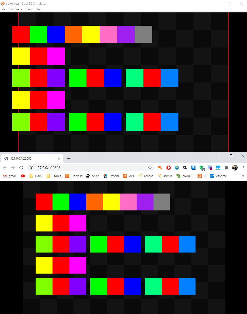
I just made a test to check this on my Windows 10 system, and I’m not seeing any issues.

Test Source (so you can run it and see what happens for you): https://github.com/roaminggamer/RG_FreeStuff/raw/master/AskEd/2020/07/color_test.zip

Test of run( simulator on top, browser on bottom):

Note: My test is using rectangles filled with colors. I wonder if there is any difference for images…

I’ll check. Meanwhile, let me ask a question. I assume you’re using PNG files. Can you upload one here for folks to test?

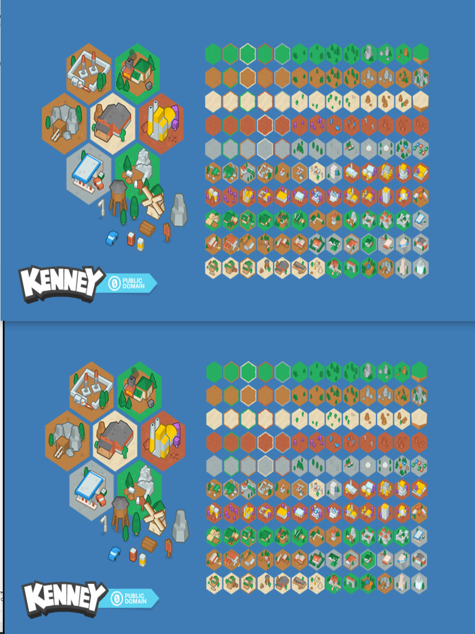
Yeah, I’m not seeing any problems with PNG files either:

Code:
https://github.com/roaminggamer/RG_FreeStuff/raw/master/AskEd/2020/07/color_test2.zip

Result (simulator on top, browser on bottom)

I don’t have a Mac or I’d test there too.

PS - I’m running Chrome.

Hey, roaminggamer, thanks for your reply.
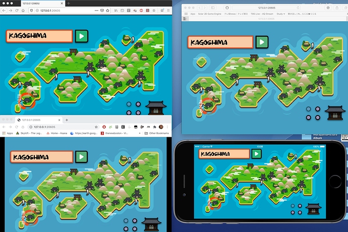
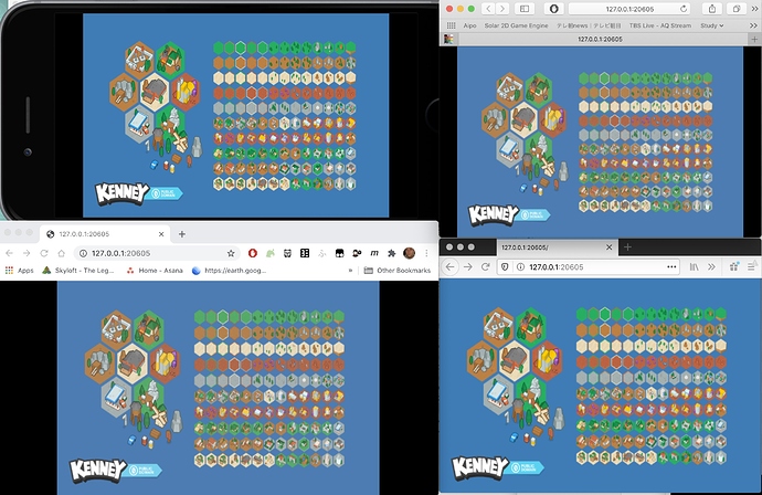
I’ve done some more tests on my end. On my mac, Firefox gives the same colors as the simulator, while Safari and Chrome are off… Here is the same screenshot (Firefox top left, Safari top right, Chrome bottom left, simulator on the right), the screen is composed of several png images:

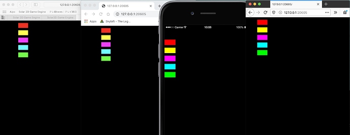
I’ve done a quick and dirty test with several rectangles filled with color -display.newRect(), it is harder to see, but the results are the same (From left to right - Safari, Chrome, Simulator and Firefox):

Very strange…

P.S. As I’ve said above, the same washed out colors are on my devices as well when built (iphone 7 and iPad pro…).

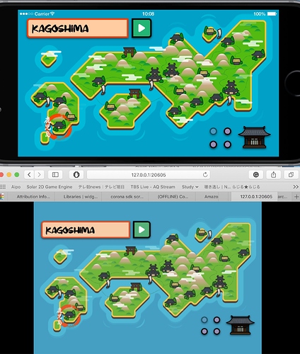
This is a screenshot I captured from my iPad:

And this is a screenshot from the simulator:

I think the difference is evident…

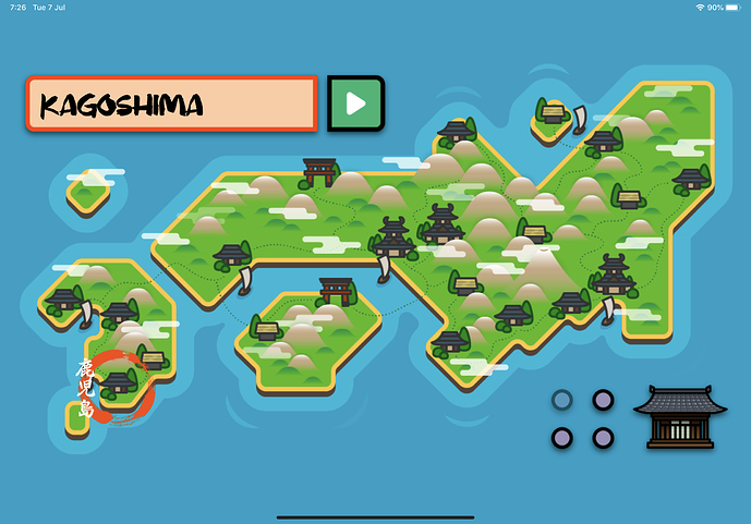
I don’t know if this is the right way to upload the thing, but this is s simplified version of the project from which I took the screenshots, the map is created by several png files:

@roaminggamer This is a test with the color_test2 : - clockwise - Simulator, Safari, Firefox and Chrome:

the first color_test, again Simulator, Safari, and Chrome and Firefox below:

I don’t know a lot here, but maybe the browser difference is a color management issue (i.e. settings are wrong in browser or not working properly).

However, I have no idea why the images are goofed up on your mobile device. I seem to remember, long ago, that images got manipulated by Apple’s software when packing the app for delivery to the store. I wonder if that is the problem.

Hi, I am quite new to Solar2D but one of the first things I recognized was that the colors of the simulator and on the device (Android Samsung S7) were different. On the device they are much more vibrant, almost to bright for me. With HTML5 I did not recognize any difference (on the same comuter).

@roaminggamer
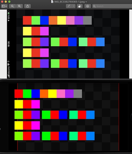
Well, I’ve just built the test app with the simple colored rectangles on my iPhone and compared it with the simulator, still the same difference. I’m uploading the comparison. iPhone screenshot on the top, simulator on the bottom. This time these are not .png images, so no compression (i think), but still the same result, especially noticeable with the reds, greens and yellows.

.

P.S. Actually a colleague of mine built the same test on his mac and ran the app on his iphone with similar results - washed out colors… Wonder is this something that happens with all apple devices when built with mac… Is someone willing to test this on mac and ios device?

Just throwing in a guess here, but maybe pngcrush has something to do with this?

https://docs.coronalabs.com/guide/distribution/advancedSettings/index.html#png-processing

@XeduR,
Thanks for the suggestion. Just tried it with skipPNGCrush = true` in build.settings, but unfortunately to no avail. I guess it’s no surprise, since the squares are not png images… The same test as above, with skipPNGCrush set to true (Simulator above, iPhone screenshot below):