I was trying to make layout for ipad split view / multiple window. The issue is that the contents in the game gets squished. I am using adaptive scaling. Say I have a circle in the center, in the ipad, if I change the window size of the game, the circle became an ellipse. The game perfectly handles portrait to landscape orientation (or vice versa), but makes everything a weird scale in split view. Anyone facing the same?
If you want to maintain aspect ratio while resizing then you need to use letterbox scaling.
If you want to use adaptive scaling for whatever reason then I think you can manage to offset scaling if the resize event triggers.
Here’s an untested code snippet:
-- Define your target/design aspect ratio (e.g., 320/480 or 768/1024)
local designW, designH = display.contentWidth, display.contentHeight
local designAspect = designW / designH

-- A group to hold your game contents for easy scaling
local gameGroup = display.newGroup()

local function onResize( event )
    -- 1. Get the new physical dimensions
    local currentW = display.actualContentWidth
    local currentH = display.actualContentHeight
    local currentAspect = currentW / currentH

    -- 2. Calculate a uniform scale factor
    -- This ensures objects stay proportional based on the change from design size
    local scale = 1
    if (currentAspect > designAspect) then
        -- Window is wider than design (Landscape/Wide Split)
        scale = currentH / designH
    else
        -- Window is narrower than design (Portrait/Narrow Split)
        scale = currentW / designW
    end

    -- 3. Apply uniform scaling to the group
    -- This prevents the "squish" because X and Y scale by the same amount
    gameGroup.xScale = scale
    gameGroup.yScale = scale

    -- 4. Re-center the group in the new window space
    gameGroup.x = display.contentCenterX
    gameGroup.y = display.contentCenterY

    print("New Aspect Ratio: " .. string.format("%.2f", currentAspect))
end

Runtime:addEventListener( "resize", onResize )

-- Initial call to set the layout on start
onResize()
Thank you, this is the approach I expected to work on. I use the “resize” event to handle portrait / landscape layout. When the device change orientation, I completely change the layout by checking the display.actualContentWidth and display.actualContentHeight. But the issue with split view is that, when I resize the game window the display.actualContentWidth and display.actualContentHeight do not change at all. Although I resized the window to be a square, where I expect those two dimensions to be similar. But they keep reporting the initial fullscreen dimension. I checked display.actualContentWidth, display.contentWidth, display.safeActualContentWidth (and their height versions), none of them change at all while the app resized. Only the dimension that changes with resizing is display.pixelWidth and display.pixelHeight. They report the correct dimensions all the time. Now working on these two dimensions are not practical, since all I care about device independent pixel and display.safeActualContentWidth, display.safeActualContentHeight to properly draw the objects safely.
Landscape orientation of the same (different layout, okay)
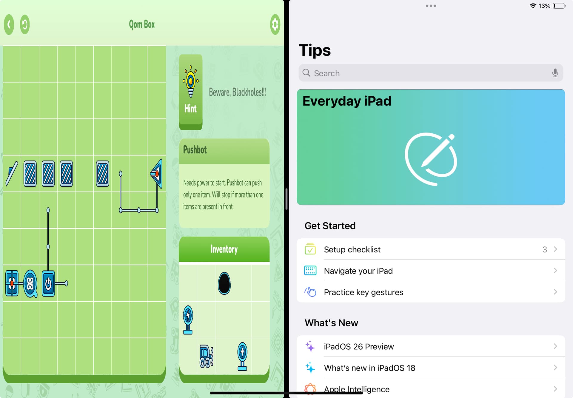
Split from landscape orientation, now the game on the left side of the screen, another app “Tips” on the right side of the screen (wrong scaling, display.actualContentWidth and display.actualContentHeight still reporting the same dimension as before split).
I also tend to use adaptive design rather than letterbox, since I create more apps than games. Are you creating the screen elements with fixed width and height? Have you tried making the height and width of the elements dynamic in relation to the screen size? I believe that might solve the problem.
Can anyone please try to run their app on a split view in an ipad device and let me know if it gets distorted or not. You may need to to set UIRequiresFullScreen to false in build.settings to allow ipad split view.
In short, the issue I am facing is that, if I draw a simple circle, it should always appear as a circle (big or small) no matter the orientation and “letterbox” “adaptive” scaling and so on. But in ipad split view, a drawn circle becomes an ellipse. Everything is getting distorted. Thank you.