One of the things that makes Corona great is that we offer over 1,000 API calls to make your life as a developer easier. This includes various convenience APIs that make our simple-to-use APIs even simpler.
However, sometimes those convenience methods can be less of a convenience and more of a headache when you try to use them beyond what they were designed for. Let’s examine the widget.* library as an example.
The widget.* library contains API’s to create buttons, switches, tableViews and more, but they were created with the intention of emulating the look and feel of iOS and Android UI elements. Corona Labs eventually added options to alter their look so they could be themed to fit your game or app better. The problem is trying to theme these widgets can be more complex than building a custom widget on your own. One of these widgets is the widget.newProgressView.
In its simplest setup, the widget.newProgressView is quite simple:
local widget = require( "widget" ) local progressView = widget.newProgressView({ left = 50, top = 100, width = 220, isAnimated = true }) progressView:setProgress( 0.5 )
And you get:

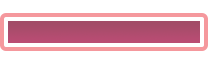
when the progress is set to 50%. It’s a simple iOS-like progressView. If you change the widget theme to Android, it will be more familiar to native Android apps. But what if you want to do something that fits your app better? Well you can use image sheets to do that. Let’s look at the code first:
local options = { width = 64, height = 64, numFrames = 6, sheetContentWidth = 384, sheetContentHeight = 64 } local progressSheet = graphics.newImageSheet( "widget-progress-view.png", options ) local progressView = widget.newProgressView({ sheet = progressSheet, fillOuterLeftFrame = 1, fillOuterMiddleFrame = 2, fillOuterRightFrame = 3, fillOuterWidth = 64, fillOuterHeight = 64, fillInnerLeftFrame = 4, fillInnerMiddleFrame = 5, fillInnerRightFrame = 6, fillWidth = 64, fillHeight = 64, left = 50, top = 200, width = 220, isAnimated = true }) progressView:setProgress( 0.5 )
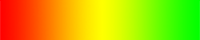
There is a lot more you have to do to set it up code wise, but in addition you have to provide an image sheet that has to be specially constructed. It’s a six frame, 64px X 64px per frame image, where you have an outer frame and an inner fill. Frames 1 & 3 represent the end-caps of the outer frame, frames 4 & 6 represent the fill of the end caps. Frame 2 is the outer frame that’s stretched to fill the size you’ve set (width = 220 above) and frame 5 is the actual progress image that will be stretched to the percentages the view is set to. Even with this, it’s limited. This image sheet (ignore the background colors, they are there just to show you each frame):

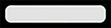
will result in a progressView that looks like:
That frame and fill may not be what you want. What if you want to have something like a red to yellow to green gradient and perhaps have a pointer that shows where in the red to green range you are? Well you can’t really do that with this widget. Why? Because the middle frames stretch to the width and then the end caps are added.
But you can do this with one image and one display.newRect() if you don’t mind rectangles, or a third image to act as a mask if you want rounded corners.
Let’s look at an example that will give you that gradient “temperature gauge”. Starting with this image and mask:
and:
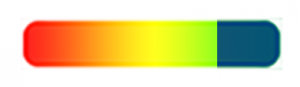
The image will be the background of our progressView and the mask will be used to give it rounded corners. We will also use a display.newRect() and fill it with a navy blue color that will block out the percentage of the gradient that hasn’t been reached yet. At 75% progress we should have something that looks like:
The code for this is quite simple. Let’s make a function to create a new gradient progressView and also create a method to set the percentage.
local function customProgressView(percent) local thisProgressView = display.newGroup() thisProgressView.backgound = display.newImageRect(thisProgressView, "pvBackground.png", 200, 40) local mask = graphics.newMask("pvMask.png") thisProgressView:setMask(mask) thisProgressView.progress = display.newRect(thisProgressView, 100, 0, 200, 40) thisProgressView.progress:setFillColor(0,0.25, 0.5) thisProgressView.progress.anchorX = 1 thisProgressView.progress.width = 200 - (percent \* 200) function thisProgressView:setProgress( percent ) self.progress.width = 200 - (percent \* 200) end return thisProgressView end local progressView3 = customProgressView(0) progressView3:setProgress( 0.75 ) progressView3.x = display.contentCenterX progressView3.y = 350
Start by creating a display.newGroup() to hold the progressView. This will not only serve as a single display object that we can easily position, but also act as a table to hold the three display objects and the function to set the percentage. The function will return a handle to the display.newGroup() that you will manipulate in your code.
Next set the background image using a display.newImageRect() to load our gradient background image. This tutorial hard codes the size, but you can easily pass size parameters to the creation function. A graphics.newMask() is added to the group, so that any other display objects added to the group will be affected by the mask.
A display.newRect() is created and stored in the group as well. This will hide the progress yet to be achieved. This requires a little trickery to work right. Anchor the rectangle to the right side. Set the color and use the .width value of the rectangle to size it to how much you want to block.
Add a function to the group that can be used to set the percentage after the initial creation. It’s the same math used above.
Finally return the group to the calling function. Then in the calling function, you can initialize the progressView and then set the percentage.
The entire function and code to position and set the value 22 lines of code. Trying to use the widget.newProgressView()‘s theming option is 28 lines (plus the widget itself!), can’t do this kind of customization, and is more code.
Hopefully this will demonstrate that some things you think are hard are actually pretty simple.