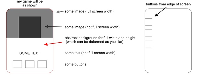
As a newcomer to mobile development, it’s very hard for me to understand how to solve the problem with different screen sizes. Now I have a few questions. 1 - Do I understand correctly that I have to make several sets of all used graphics for different prefixes of increase (x2, x4, etc.)? 2 - Will these kits fit if the game is running on a tablet, or do tablets need a separate version of the game? 3 - I was advised of such a config for my game (guess a movie by frame, only portrait orientation):
	content =
	{
		width = 320,
		height = 568,
		scale = "letterbox",
		fps = 60,

		imageSuffix =
		{
			["@2x"] = 2.0,
			["@4x"] = 4.0
		}
	},
Or is there an option that is more interested in your experience, how are you doing? 4 - The x2 prefix means a set for screens twice the size of the image. Does this mean that the original set needs to be done for some minimum screen size (which is quite widespread)? 5 - With my config settings, can I put the button so that it starts from the edge of the screen indicating its coordinate along x = 0 or when scaling it can still run a little? 6 - Graphics sets for x multiple increase, as I understand it, are the linear sizes of images, and what should be ppi, is 200 ppi enough? 7 - What size should be followed when creating sheets of images, is it possible to put all the graphics in a sheet of 2500 x 2500 px 200 ppi or do I need to break it into smaller parts?
Many thanks for your help.

