How to center rows of objects

Hello. I need to center the rows of objects created in a nested loop. My code is this:


        local Tab { { ["nestTab"] = { 3, 5, 7 } }, { ["nestTab"] = { 3, 6, 2 } }, }
	local xPos = 40
	local yPos = 295
	local iCnt = 1

		for i = 1, #Tab[indX]["nestTab"] do
			for j = 1, Tab[indX]["nestTab"][i] do
				local btn = widget.newButton(
					{
						...
					}
				) 

				btn.x = xPos * iCnt
				btn.y = yPos
				iCnt = iCnt + 1 
				
			end
			yPos = yPos + 40
			iCnt = 1 
		end

In the nested table, each element is a new row, and the value of the elements is the number of objects in this row.


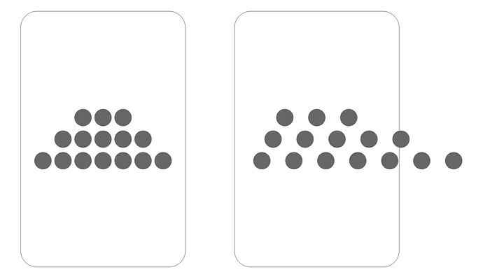
If I use the starting xPos and yPos with an increase in the loop, the rows of objects are left aligned, and I need to be centered. Tell me how to do it better, I think you can use groups here, but I can’t figure out how.

Would something like this work for you?

local elements = {}

local widthRow = display.contentWidth
local widthElement = 50
local numElements = 10

local distanceBetweenElements = (widthRow - widthElement * numElements) / (numElements + 1)

for i = 1, numElements do
	local rect = display.newRect( 0, display.contentCenterY, widthElement, widthElement )
	if (i == 1) then
		rect.x = rect.width / 2 + distanceBetweenElements
	else
		rect.x = elements[i - 1].x + elements[i - 1].width + distanceBetweenElements
	end
	
	table.insert(elements, rect)
end
2 Likes

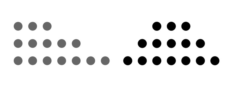
Thank. The code works, but not quite what I wanted. The number of objects in each row, as well as the number of rows themselves, are stored in a table. Therefore, the distance between the objects should be fixed and small enough if there are a lot of objects in the row. But it turns out that the distance is calculated from the number of objects in the first row and applied to the rest of the rows. It turns out that the rows are centered from the left, and then, due to the difference in the number of objects, the stretching occurs. I tried to figure out what to change myself, but it did not work out for me, I attach the image for clarity.

Calculate the horizontal spacing as you go, row by row.

Alternately, calculate default tween spacing based on the last row or the row with the most objects in it.

3 Likes

If that doesn’t make sense, please clearly define the rules for your spacing.

Ex:

  • horizontal tween spacing - must be uniform for all objects in all rows
  • vertical tween spacing - must be same as horizontal tween spacing
  • single row - Any single row must be horizontally centered on the screen
  • All rows - All rows must be (as a group) vertically centered on the screen
  • Columns - As a side-effect or the row rules objects need not be oriented in columns. i.e. If a row has two objects and the row below has 3, the objects in the top row will not be vertically aligned with those below.

Note: The rules above match what I can decipher of your left image, excluding the columns rule, but then you don’t show a row with an even number of dots so I can’t be sure.

If the rules above work for you, you can do this:

  1. Iterate over the rows and find the row with the most objects.
  2. Use that value, plus the width of objects (assumes they are all uniform) and calculate a tween spacing.
  3. Now, having the object sizes and the tween spacing, you can calculate the y-position of the first row. Start there and create your rows, top-to-bottom.
  4. When creating a row, use your calculated tween and object sizes plus similar code to what @bgmadclown gave you and violla! You are done.
2 Likes

The rules are as follows: horizontal tween spacing - must be uniform for all objects in all rows and any single row and any group of rows must be horizontally centered on the screen.

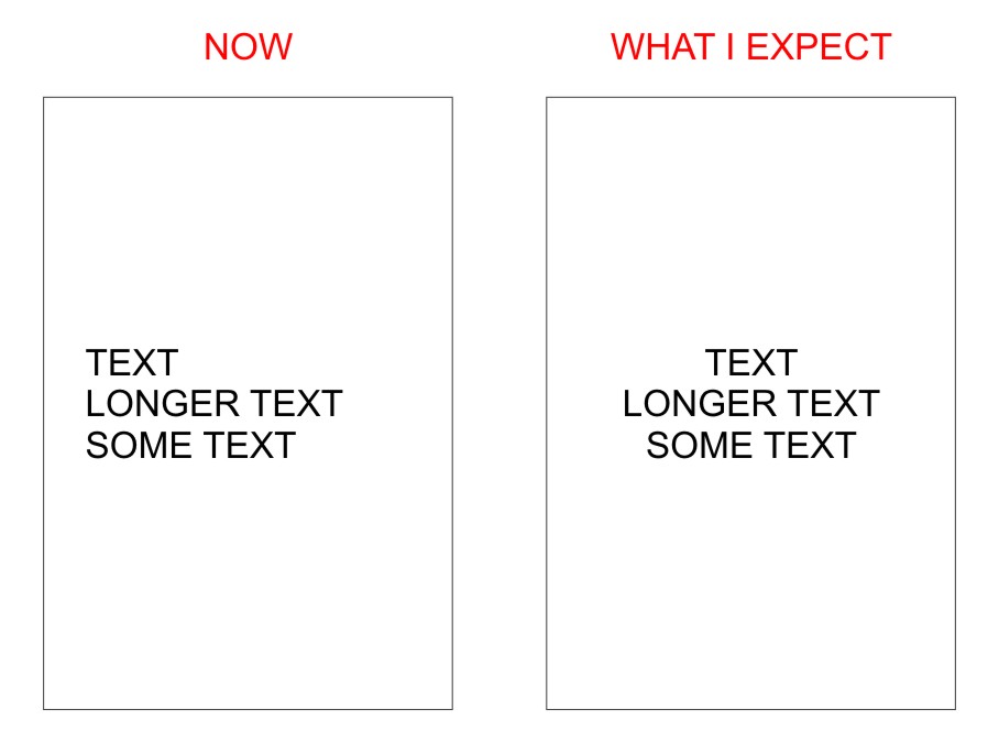
I am trying to achieve alignment such as in the Word editor center alignment. My objects are letters, so the spacing should be the same. I know the longest line, so I would like to have the same spacing for all lines calculated by the longest.

for i = 1, #Tab[2]["nestedTab"] do  
	local numElements = 10 --the longest word is 10 letters
	local distanceBetweenElements = (widthRow - widthElement * numElements) / (numElements + 1)
		for k = 1, Tab[2]["nestedTab"][i] do 
--this key contains the number of letters for the word (by number [i]) of second record
			local btn = widget.newButton(
					{
					...
					}    
				)   
				btn.x = 0  
--Not sure if I need to set some position on X here
				btn.y = yPos 
--vertical layout is not critical, I just add some number later
				btnTab[#btnTab + 1] = btn 
				if (k == 1) then  
					btn.x = btn.width / 2 + distanceBetweenElements
--as I understand it, the position of the first object (letter) is set here
				else
					btn.x = btnTab[k - 1].x + btnTab[k - 1].width + (btnTab[k - 1].width / 5) + distanceBetweenElements
--and here I added (btnAnTab [k - 1] .width / 5) to increase the interval
				end
			end
			yPos = yPos + 40
		end

IMHO. I tried something similar with text, where I split and re-align the text. I had to always call display.newText() to get the actual correct length of the text cause different fonts/device will have different lengths. But the multiple calls to create display.newText() was too heavy on the device and caused it to lag.

In my case, this is not the text itself, but a button with a letter. For the position of the first button (letter in the word), I wrote btn.x = (display.contentCenterX - total number of buttons * widthOfButton + (total number of buttons - 1) * 10)) / 2 Where 10 is the total interval between the buttons for all rows. But for some reason, the series is still not centered. Adding another + 10 at the end, I got an almost perfect option. Who will tell you where I made a mistake, why I need to add another 10 and why the result is still slightly off-centered. The following buttons are positioned for me like this: btn.x = previousButton.x + widthOfButton + 10

I used something like pseudo code, I want to understand the calculation.

If you’re pre-calculating the positions based on letter counts, then creating individual text objects using a proportional font, you will not get the results you want. Why? Because proportional fonts do not produce letters of the same width for all letters. Some are wider, some are narrower.

You need to use a fixed-width/monospaced font if you want the calculations to be easy.

Regardless of what objects we are talking about (letters or otherwise) if the objects are not all the same width, you need to:

  • Create the objects
  • Measure all of their widths.
  • Move the object based on your desired tween placement.

Hi again.

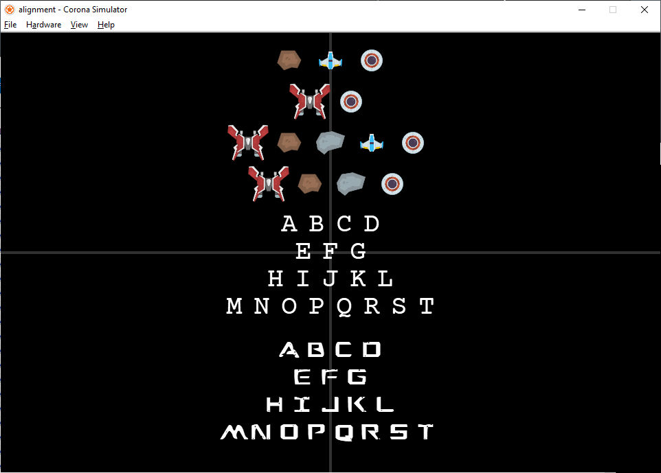
I’m still a bit confused about your needs, but I’ve put together an example showing one of many ways to align objects and place them.

I hope you’ll be able to work out a solution from the prior posts by others and myself and perhaps from this example.

https://github.com/roaminggamer/RG_FreeStuff/raw/master/AskEd/2020/05/alignment.zip

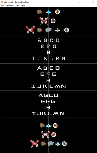
Here is another example (expansion of last) showing how to do proportional alignment with edge-to-edge spacing.

https://github.com/roaminggamer/RG_FreeStuff/raw/master/AskEd/2020/05/alignment2.zip

View both examples using borderless iPhone 640x960 simulator or larger