@hasen,
Last post for now.
I wanted to take a moment to explain some critical concepts I may have failed to explain previously which may be contributing to the confusion here.
Important Concepts
-
Content Area - This is essentially how big your assumed design space is. You tell Corona this in config.lua.
-
Contet Scaling - This is how Corona decides to scale your content area to best fit the current screen.
-
Screen Size - This is the true pixel size of the screen on the device your app is running.
These three factors combine to later determine how your Content Area is scaled and thus how your content is scaled.
Content Scaling (letterbox)
Corona does its best to fit your Content Area onto the Screen Size. This is controlled by the scaling style you are using.
Assuming you are using ‘letterbox’ scaling, this means corona will scale up (or down) the content area so that no content within the bounds of content.width and content.height is clipped.
It also preserves the aspect ratio. i.e. X and Y are equally scaled so there is no warping of your content.
This means that sometimes there will be unfilled space either on the sides or the bottom. This is important.
display.contentScaleX, display.contentScaleY - Tells you how much your content is begin scaled.
- For example if these values are 2 and your original design included a 10 by 10 rectangle, that rectangle is now being scaled to 20 by 20 for the current device/screen.
Group Placement
By default, Corona places all groups at position <0,0>.
This position aligns to the upper-left corner of your Content Area .
It may or may not align with the upper-left corner of the screen. That is determined by how well the content fits the screen when scaled.
It also depends on whether you have gone with default alignment rules (in config.lua) or whether you have selected alternate rules.
Display Object Placement
By default, Corona places all display objects by their center into a group. i.e. The center of the object is at the position you specify.
If you do not specify a display group, objects are placed in the default group: display.currentStage. This group in turn is always aligned to <0,0> of your Content Area .
You may alternately place objects into groups you create. If you change the x- and or y-position of those groups, then the object will be placed in the Content Area at position: < object.x + group.x, object.y + group.y >.
Content Area Offsets
A big confusion point for users is the fact that sometimes there are ‘black’ bands on the top or sides of the user’s content Content Area.
This is occurring because the Content Area did not scale to fit the screen space perfectly. i.e. The aspect ratio of the screen did not match the aspect ratio of the Content Area so, there is some left over vertical or horizontal space.
Corona deals with this (in letterbox scaling mode) by simply placing the content in the center of that space. Thus there are equal sized padding areas either on the top and bottom or left and right.
When this occurs, your Content Area may no longer align to the upper left corner of the screen.
Dealing With Content Area Offsets
We spoke about this previously, but in summary there are a few ways to deal with this problem.
- Calculate the left and top edges of the screen and move all groups to that position.
- Calculate the left and top edges of the screen and place objects relative to those values.
- Modify the alignment rules in config.lua
I have previously shown you how to do these calculations. So, I will conclude this (long) post with some code and a picture showing the results.
https://github.com/roaminggamer/RG_FreeStuff/raw/master/AskEd/2018/04/placements.zip
main.lua
display.setDefault( "background", 1, 0, 1 ) -- local g = display.newGroup() -- local r0 = display.newRect( g, 0, 0, 640, 960 ) r0:setFillColor(0.125,0.125,0.125) r0.anchorX = 0 r0.anchorY = 0 -- local r1 = display.newRect( g, 0, 0, 200, 10 ) r1:setFillColor(1,0,0) r1.anchorX = 0 r1.anchorY = 0 -- local r2 = display.newRect( g, 0, 0, 10, 200 ) r2:setFillColor(0,1,0) r2.anchorX = 0 r2.anchorY = 0
config.lua - ex1 (default alignment)
application = { content = { width = 640, height = 960, scale = "letterbox", }, }
config.lua - ex2 ( upper-left alignment)
application = { content = { width = 640, height = 960, scale = "letterbox", xAlign = "left", yAlign = "top" }, }
Results
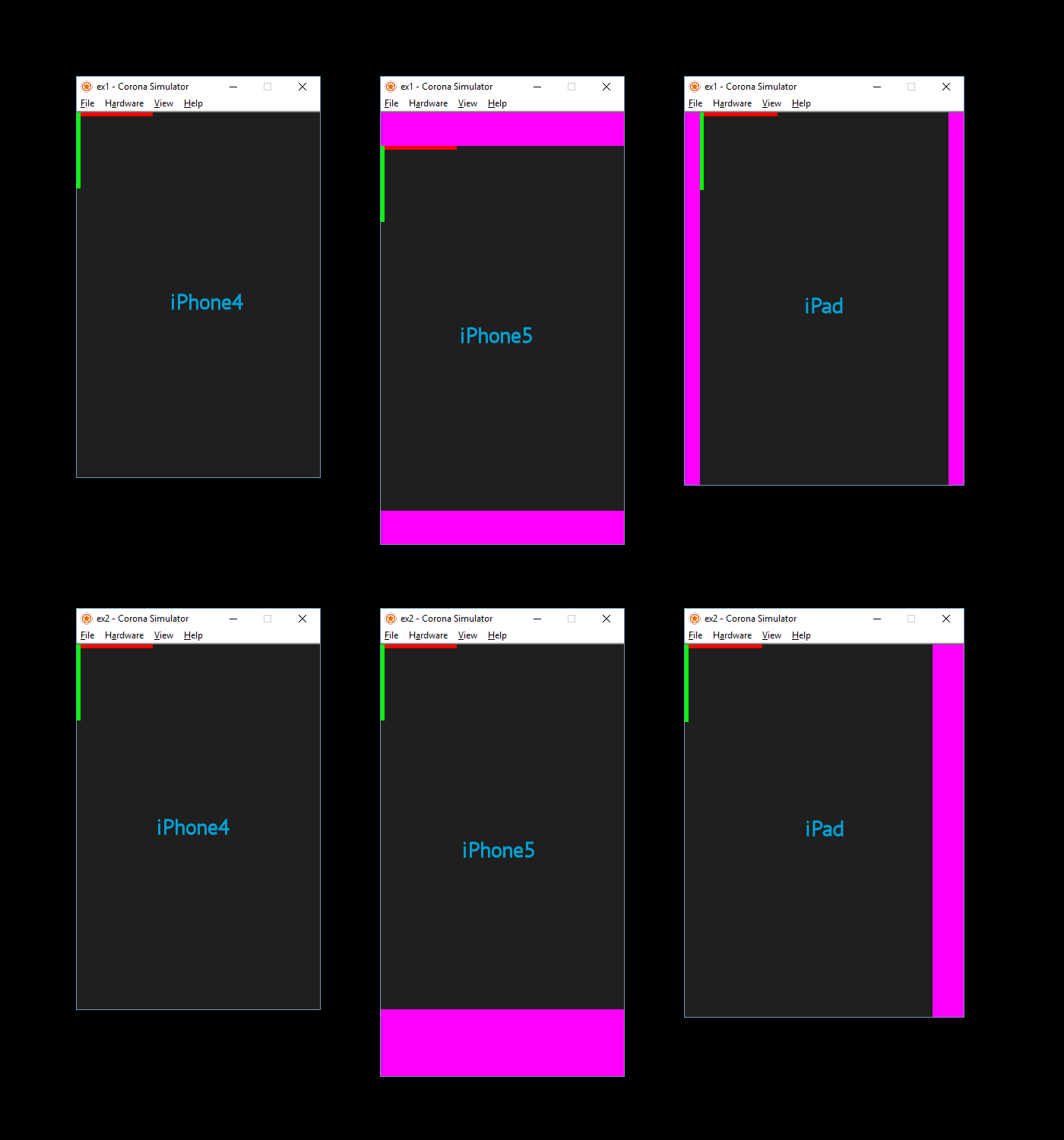
This image shows the results for both tests on iPhone 4 (same size as Content Area), iPhone5, and iPad.
ex1 is the top row
ex2 is the bottom row


