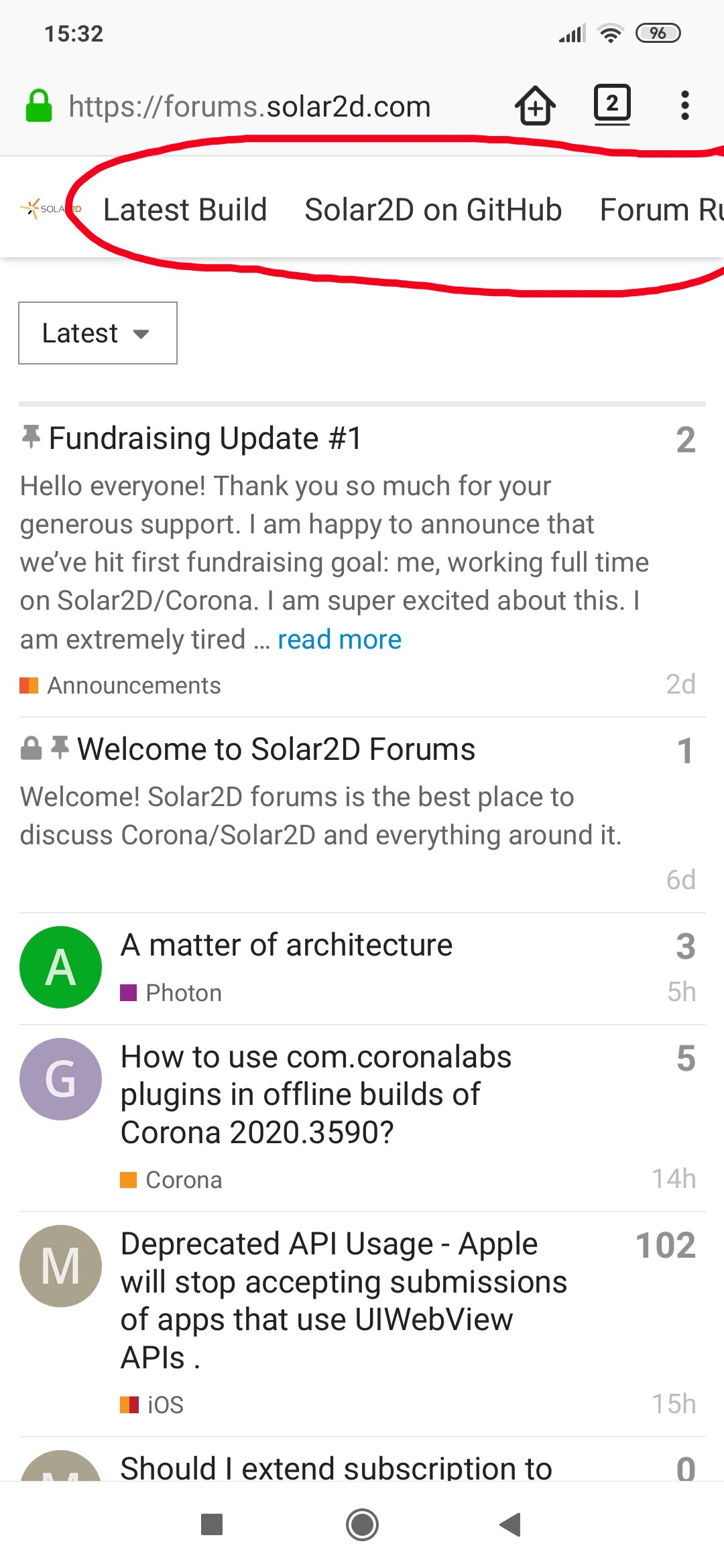
- The header in the mobile version of the forum is not displayed correctly, the line does not fit on the screen (see screenshot).
- In dark mode the Solar2D logo remains white, so it would be nice to replace it with a dark version of the logo.
- As already mentioned in the next topic, old forum posts are repeated. This makes navigation a little difficult. It would also be nice to streamline the forum’s categories, as it looks a bit untidy now.