This is now practice to see if I CAN reach the level of excellence…  Bash away. [import]uid: 51459 topic_id: 21562 reply_id: 321562[/import]
looking good! [import]uid: 10389 topic_id: 21562 reply_id: 85443[/import]
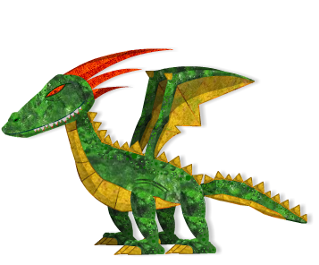
I like it but I’d suggest doing something with the, uh, red bits coming off the head. (I can’t think what to call them off hand.)
They look flat compared to the body.
Maybe also the eye?
Looks good anyway, loving the new look!
Peach  [import]uid: 52491 topic_id: 21562 reply_id: 85464[/import]
Yeah I like it. The style/texture kinda looks like it’s been made out of real scrap paper/card, if that makes sense.
I suppose the shadowing breaks that illusion a little but it depends if thats a look you’re going for!
However if you meant to give it more depth (3d looking) I think it does look flat. If your going to animate this though, you’re better off keeping it flatter looking, it’ll save a bunch of headaches.
Aaron [import]uid: 118390 topic_id: 21562 reply_id: 85538[/import]
Made a few changes… 
Thanks @gravityapple and @peach for giving me some constructive criticism. Very helpful indeed 
AND THANK YOU @WauloK!!! [import]uid: 51459 topic_id: 21562 reply_id: 85550[/import]
Hey, Jake, to be honest, I liked the previous version (without the new texture added) better, but that’s just a personal taste. Also, it depends on the context – meaning, what your other art assets look like and how it fits together. In fact, textured version might look much much better in the context you place it in.
I’d consider making the two pointy spots on the stomach smoother so that you don’t see the pointy points – unless, of course, you are going for that look on purpose because that works better with the overall look of your game.
I’d also consider making the yellowish orange outline less conspicuous. It pops out. It’s okay on its wing and its belly, but outline could use a bit more subtle color – unless, again, it is intentional because it looks right when it’s placed in the game with other art assets.
I hope this helps.
Naomi [import]uid: 67217 topic_id: 21562 reply_id: 85574[/import]
Thanks @naomi just fixed the belly… For the other assets… i plan on having little knights fight this dragon with tin foil texture for there armor… so yea everything is going to match great!! [import]uid: 51459 topic_id: 21562 reply_id: 85582[/import]
Cool. Do I see a yellow/orange circle on the tip of the red horn? Also, the claws could use a bit better outline?
Naomi [import]uid: 67217 topic_id: 21562 reply_id: 85586[/import]
Thats part of the spike thats on the wing that you are seeing… i will look into fixing the outline on the claws) Thanks again… [import]uid: 51459 topic_id: 21562 reply_id: 85599[/import]
Just updated it!! Thanks @naomi You where a big help!! Its now nice and shiny) [import]uid: 51459 topic_id: 21562 reply_id: 85620[/import]
Hey, Jake, I’m glad I could help a little. Good luck with all your effort!
Naomi [import]uid: 67217 topic_id: 21562 reply_id: 85632[/import]
Glad to help out  [import]uid: 10389 topic_id: 21562 reply_id: 85662[/import]
I personally like the dragon that you posted before, the one i linked below looks even better. I think that the dragon looks better at first sight, but I don’t know much about your game so I can’t judge which one fits in.
Link :http://developer.anscamobile.com/forum/2012/02/02/my-dragon-polished-enough
Looks great though!
[import]uid: 23689 topic_id: 21562 reply_id: 85665[/import]
The very first one Dragon is much “comic”, looking like more a “funny” style and it is nice in my point of view.
The Dragon posted here into this forum is much more “realistic”, it`s a kind of “comic” + “real” and it is nice too, but I do not know why I dislike the “head” of the dragon, much more in this Dragon posted here than the other one, that as I said it did look like more “comic” for me and so the head there would “shine” less than it is doing here (even more with the “realist” texture that the Dragon got).
It`s my own opinion and so it would not be considered anything than an personal point of view btw.
Cheers,
Rodrigo. [import]uid: 89165 topic_id: 21562 reply_id: 85667[/import]
thank you for all of your thoughts… I plan on showing everybody all my assets once there done with a background… to see if they all fit together… thank you again…  [import]uid: 51459 topic_id: 21562 reply_id: 85691[/import]

