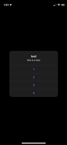
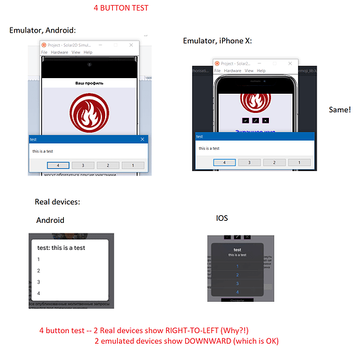
Hey guys, if I use native.showAlert() with a set of buttons from a table on Android (and emulator - any emulated phone) they go left-to-right (or downwards depenging on the design), on iOS they go right-to-left (or upwards). Indexes of pushed buttons work as planned, but for some reason the positioning is just oposite to each other…
It does not bother me really (especially if there are just to buttons in the set like “yes” & “no” or “close” & cancel), but if there are at least 3 buttons or more, then it is better to keep the sequence the way a user reads.
Suggestion for the developers 
On iOS and Android(test on a Samsung), the buttons go top to bottom for me (<= four on Android and < 2 on iOS). Android does flip if buttons are less than >4 but has more to do with how Android presents alerts and how solar2d handles the buttons. On Android the first button is “positive”, the second is “neutral” and the third is “negative”. While Android types vary, most show the “positive” on the right. “Neutral” and “negative” on the left.
Create buttons with labels [1], [2], [3], [4]…
local buttonLabels_T = {“1”, “2”, “3”,“4”}
Why on iOS they will go as 4-3-2-1? Because something is negative or positive? Answer - because it handles the table from the other end.
UPDATE: on iOS they go the way we see them in the table.
?
timer.performWithDelay( 3000, function  ()
  native.showAlert( "test", "this is a test",  {"1", "2", "3","4"} )
end )
Let me do a more expanded research. (It brought some surprising results…)
Stage 1
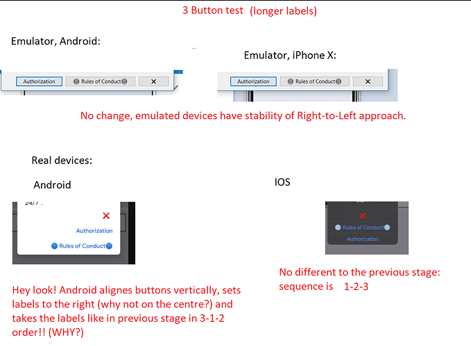
Stage 2
[THERE WAS A SCREEN SHOT HERE, BUT I LOST IT…]
I am sorry about it. Here is a description of it. Emulated devices work in the same manner: 3-2-1,
Real Android showed buttons horizontally, but the order was not neither left-to-right neighter right-to-left - you will see it in the next stage, but with longer label names. iOS showed the buttons vertically in the order of 1-2-3, as in the code.
Stage 2-B
It looks like I was wrong about Android that it handles everything well in the right order 
Stage 3 is jsut two buttons, but I will not give you any screenshots… As it was mentioned previously iOS and Android (and all emulated devices) handle the labels table from different ends, so 1-2 vs 2-1.
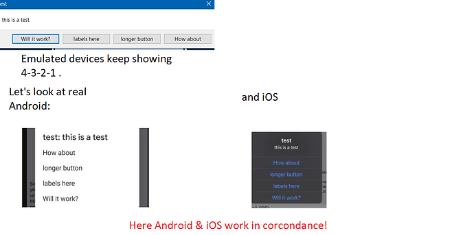
Also I did stage 1B: 4 buttons, but longer labels
`
native.showAlert( "test", "this is a test", {"How about", "longer button", "labels here?", "Will it work?"} )
`
Results of the research:
- Emulated devices handle the table opposite way we read it in the code:
“1”, “2”, “3” → [3], [2], [1] - iOS handles the table the other way round (most prefferable way - the way we read it in the table):
“1”, “2”, “3” → [1], [2], [3] - real Android was the funniest
 ; it has a mixed approach:
table of 2 goes as in emulator, mirrored:
“1”, “2” → [2], [1]
table of 3 handled as beginning-end-middle
“1”, “2”, “3” → [1], [3], [2] (Android bug? may be different devices must be used to test this…)
table of 4 is shown just like on iOS!
“1”, “2”, “3”, “4” → [1], [2], [3], [4]
Such a zoo of approaches gives lots of work to the testers… What to brush up here? Real devices or the emulator? I do not really know…
Definately, as developers we would like to see more standardised things…
This topic was automatically closed 180 days after the last reply. New replies are no longer allowed.


