Hello, solar2D world!
It was all GREEK to me.
And I was walkin’ like a newbie-Egyptian, not in denial of my ignorance
concerning all things ‘Content Scaling’ in Solar2D.
And, thanks to @Xedus pointing me in the direction of Rob’s…
…I stumbled upon the ‘Rosetta Stone’, so to speak, of Content Scaling.
But, I had to take it a step further to understand it more comprehensibly than
depicted in that very informative post.
I just personally (with my stubborn brain) needed a bit more to ‘set it in stone’.
I felt compelled to share it with the forum.
I don’t mean to clutter the forum with redundant material,
but my approach, ie. a STEP by STEP color-coded approach
that I used made me ‘personally’ understand it more thoroughly.
Any errors that you can point out will be greatly appreciated.
I think I got it correct though.
In this ‘Rosetta Stone’ post, specifically,
I like the way I emphasized (made clear) the scaling content ‘calculations’
by color-coding the steps and annotating those steps as they were carried out.
This helped to quickly associate what variables belonged to the Content Area (in orange)
and those which belonged to the Device’s actual content and corresponding device aspect ratio
( ie. depicted in blue or pink).
It should be no mystery why I chose orange, as opposed to green;
as green usually showcases the ‘safe’ content area.
I just wanted to pay homage to the history of Solar2D.
Besides, the Solar2D logo, still has lingering orange hues.
I did this little exercise solely for my sake, as a learning tool.
But, I knew someone else could probably benefit from my subtle addition to what Rob had done in the mentioned link above.
I am sure many of you have gone through these motions to wrap your brain around this issue.
We must.
Again, I like the color-coded calculations depicted in a (loosely speaking) “stairway-step” fashion,
that clearly make the calculations easy for a non ‘Carl Friedrich Gauss’ mind,
like mine, to take it all in, and make practical sense out of it.
One of the biggest takeaways, after I completed it anyway,
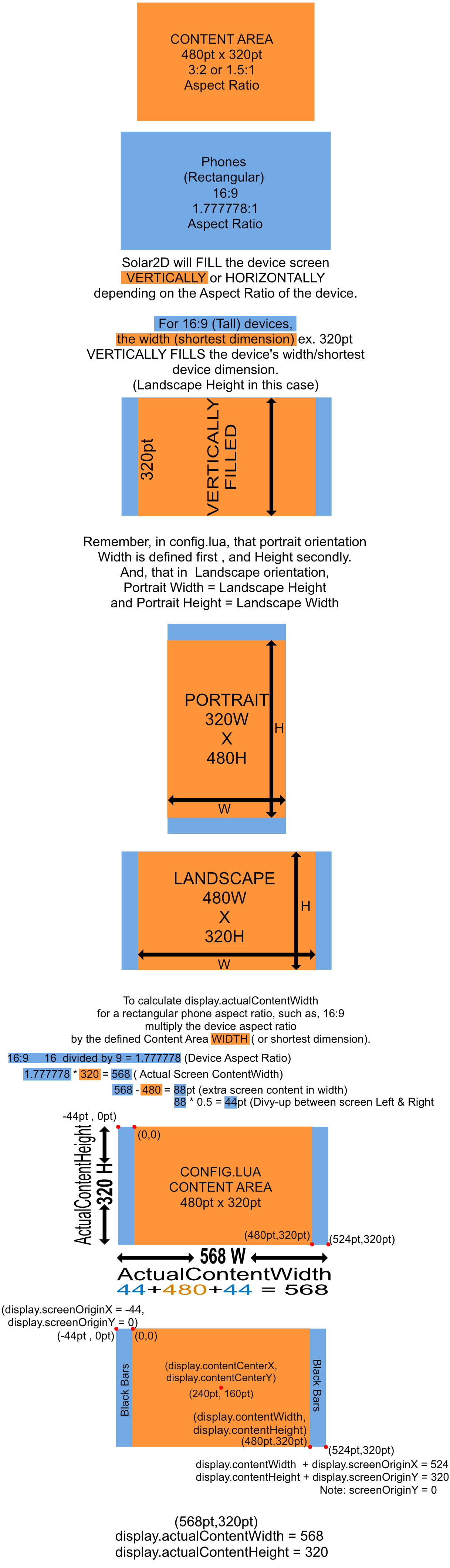
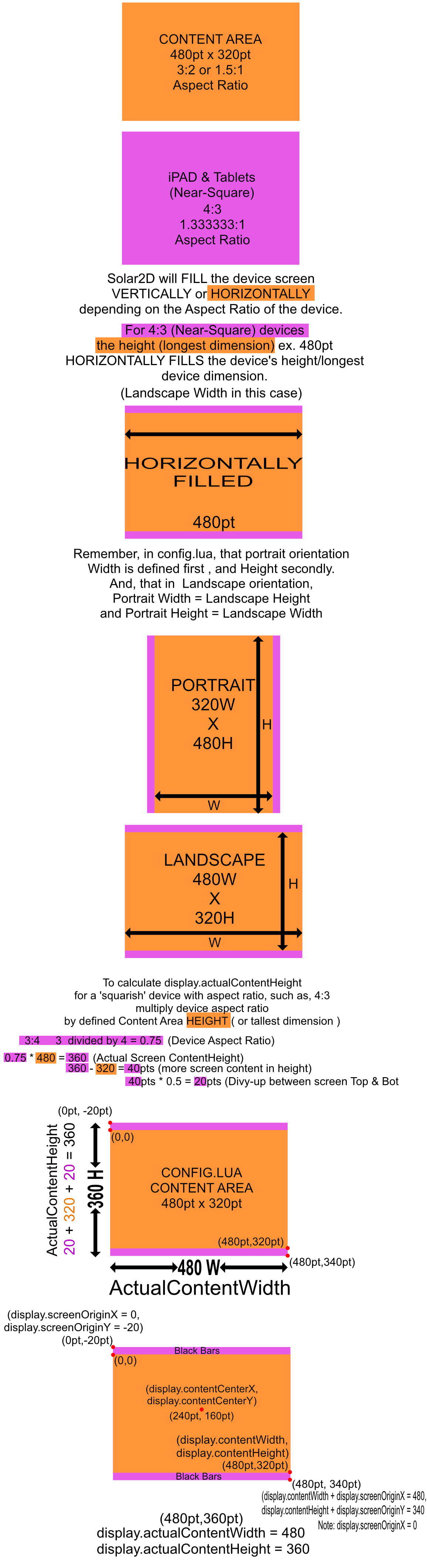
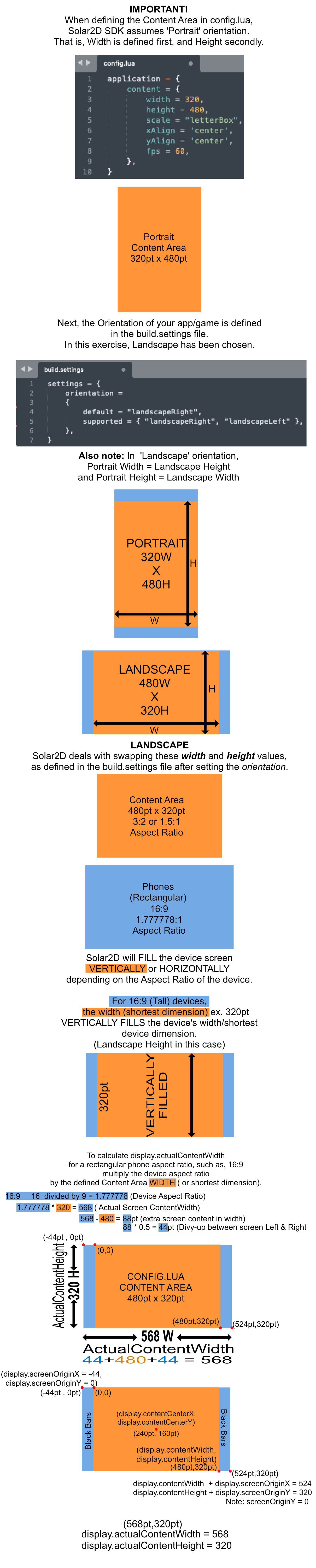
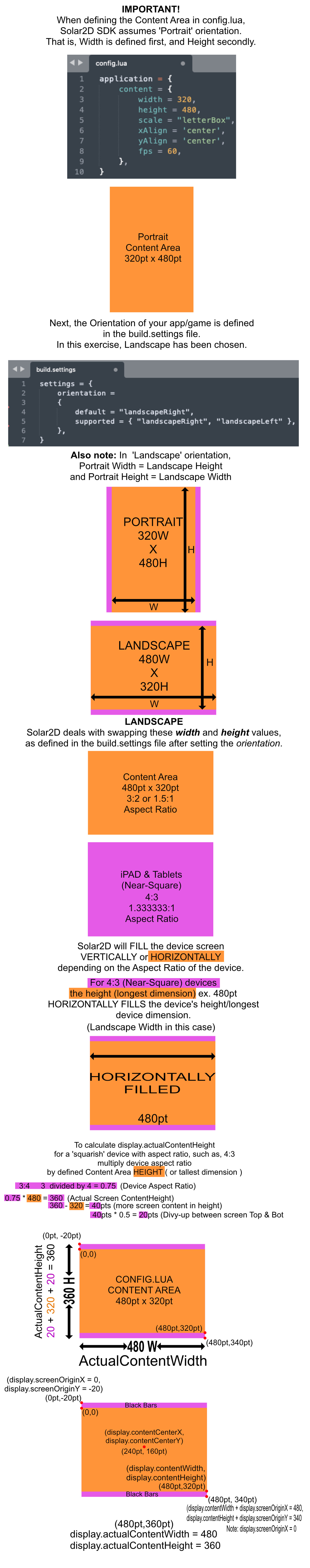
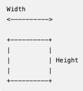
was that there is no mention of device screen resolutions (in pixels) for an actual device during the whole content-scaling ordeal; the process, for example, didn’t mention a 1920 × 1080 screen resolution nor mention of a 1024 x 768 screen resolution as being anything of concern;
rather, it deals with the config.lua defined Content Area ONLY;
and is concerned instead with the decimal values of the aspect ratios for a given Devices,
16:9 or 4:3, respectively in this post.
It reminded me that, we as developers need only focus on the ‘content area points’ that we have defined in config.lua, and, coding in that safe, scalable, protected ‘sandbox’, if you will;
‘Never mind the bollocks’ (aka nonsense), of device pixels and screen resolutions themselves.
All the while, making more sense of the display.contentWidth
and display.actualContentWidth, among others.
Of course, I won’t be surprised if I reinvented the wheel,
and this is already a click away somewhere else on this awesome forum;
Rob’s aforementioned post that inspired this post aside. Perhaps, humbly speaking of course, not as comprehensive as my ‘stairway-step’ program.
“Now, for only $300 dollars, you can sign up right now …for my eight-week program.”
Rex - From the Movie, Napoleon Dynamite
If not, I trust this will be helpful to many a spankin’-new, newbie.
I hope it is more helpful than confusing, and not at all annoyingly redundant.
Give it a try.
Decipher the mystery.
“Please, accept the mystery.”
From the movie, A Serious Man
CONTENT SCALING PART I
CONTENT SCALING PART II
To position buttons, and other UI game elements relative to screen edges, and, to see what inspired The Solard2D ‘Rosetta Stone’ to Scaling Content, see the link to Rob’s post at the top of this post.
QUESTION:
When scaling content areas, why are ratios ‘swapped’;
ie. for rectangular devices and ‘squarish’ devices?
Meaning, for a ‘rectangular-device’ at 16:9 (or 16 divided by 9 = 1.777778),
the greater number is the numerator, and the smaller number the denominator, when calculating actualContentWidth for a given device?
While, on the other hand, for the ‘squarish-device’ at 4:3 the ratio is ‘swapped’ and calculated as 3:4 (or 3 divided by 4 = 0.75) with the smaller number as the numerator, and the greater number as the denominator, when calculating the actualContentHeight for a given device?
To the mathematically inclined, I am certain that this is both painfully obvious and perhaps unnecessary to know such details.
But I was curious, as I could not answer that for myself.
Anyone?
“In 1930, the Republican-controlled House of Representatives, in an effort to alleviate the effects of the… Anyone? Anyone? …the Great Depression, passed the… Anyone? Anyone? The tariff bill? The Hawley-Smoot Tariff Act? … Anyone know the effects? Anyone? It did not work, and the United States sank deeper into the Great Depression.”
From the movie, Ferris Beullar
You know I could not pass that movie quote up.
Gilby
 ), but I may have caught two things to make it complete for Solar2D specifically: