What is the proper way to use same one source code set for different resolution on different platforms

What is the proper way to use same one source code set for different resolution on different platforms

For example, if all logic parts are totally the same code.

So, just in case, especially for the portrait and landscape difference,

eg. if I need

* the window on iOS is : 640x1136, (width < height)

* the window on Windows: 1024 x 768. (width > height), also support resizing the window

How to handle this situation properly ?

* build.settings: not sure what need to be set ?

* config.lua: how to set width, height

* scale way: adaptive, letterbox, or others ?

* widgets coordinate system adjustment, relative coordinate ?

those are general questions which require extensive posting to cover, something I doubt anyone on the forum will take the time to present.

but to get you started, focus should be on build.settings and especially config.lua when it comes to cross device settings, screen sizes and aspect ratios

there is much info on these subjects available so you’ll need to do some searching and testing yourself.

the corona documentation and guides are well made so take the time to study them, it is worth it, its how I learned 95% of what I know about corona and lua

happy coding!  :slight_smile:

* build.settings: not sure what need to be set ?

The only screen related things in this file is the various orientations your app will support. Other than that, most things in build.settings are device specific, i.e. Android settings, iOS settings, desktop settings.  There are several guides on build.settings:


https://docs.coronalabs.com/guide/index.html#building-and-distribution


* config.lua: how to set width, height

This is where you define how you want to use the screen, if you want to use dynamic images or not. It’s discussed here:


https://docs.coronalabs.com/guide/basics/configSettings/index.html


and in numerous posts in the forums.


* scale way: adaptive, letterbox, or others ?

This is covered in the config.lua guide as well. What should you use? Well that depends on what you’re building.  Adaptive is probably more practical for business style apps where you want more screen real estate on tablets than you do phones and want to keep objects like buttons and switches the same basic size. Most people making games will use “letterbox” or “zoomEven”. Using zoomEven is one way to easily avoid issues with different aspect ratios, but part of your screen will get cut off. “letterbox” is the most flexible, but how you set it up depends on what you’re making


* widgets coordinate system adjustment, relative coordinate ?

Not sure what you mean by this.


Rob

I agree.  There is no single one-size-fits-all (pun intended) answer to those questions.

Additionally, dynamic-resizing of desktop windows is an entirely different discussion that does not have a simple answer either.

I’ll assume your game is landscape, because portrait apps displayed on desktops have to be handled with a bit of ingenuity.

To start you off, I suggest using a fixed resolution config.lua file and a simple build.settings file.  You can find my starter here:

https://github.com/roaminggamer/RG_FreeStuff/raw/master/AskEd/askEdStarter.zip

(_ Tip:  The config.lua and build.settings files in this starter have links at the top to documents you must read.  Also read the guides and tutorials._)

DO NOT (unless you hate yourself) start off trying to write a complicated config.lua file with calculations, and variation for different devices.  Until you understand what a fixed resolution config.lua file does and how it behaves on various devices you are not going to grasp complex config.lua files.

Finally, there are different elements to consider when it comes to scaling and alignment.  Assuming you have a fixed resolution config.lua file (like the one I shared in my starter above), and assuming you are using letterbox scaling:

  • Parts of the content will always be visible on all screens (safe).
  • Parts of the content will be scaled off the sides or top of the screen for other devices (unsafe).

You want to keep that in mind and determine the left, right, top, bottom, full width, full height, and center <x,y> positions through calculations (SSK does this and provides globals).    With this information, you can correctly place interface elements (counters, buttons, etc.)  

Game content itself is tricky.  You need to account for and understand the safe/unsafe regions and place the important parts of your content accordingly.  For full screen worlds, horizontal and vertical scrollers, shooters, etc this is not an issue since you will be implementing a camera that keeps the player/target in focus.  For puzzle games, fixed view games, etc. This is more challenging and you must experiment early with different resolution target devices to understand how this works.

Good luck on your journey.  You have much learning ahead of you.

Note: I just updated the starter to better demonstrate the concept of safe/unsafe visible space.

I derived this starter from a long-ago created ‘magic recipe’ which I have used ever since as my starting point for all games and apps.

Yes, I occasionally go with alternate setup for clients or special cases, but most of the time this is all I need.

Again, I just updated it so if you downloaded it before reading this, get it again:

https://github.com/roaminggamer/RG_FreeStuff/raw/master/AskEd/askEdStarter.zip

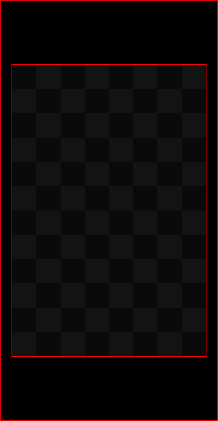
This image (included in the starter) shows  the safe/unsafe areas for the config.lua settings I used:

protoBackX.png

  • Checkered area  - Visible on all displays.
  • Black outer-fringe - Bleed area visible on some devices and not others.

https://github.com/roaminggamer/RG_FreeStuff/raw/master/AskEd/askEdStarter.zip

Here is another image that might hep you understand screens and aspect ratios.

This is rotated to a landscape view. Keep in mind values in config.lua are always specific in portrait, that is the width should always be the smaller of the values between width and height.

In this image, the green is your defined content area (assuming you use our recommended 1.5:1 aspect ratio, such as 320x480, 800x1200 etc. The blue would be your typical HDTV 16:9 phone, desktop computer monitor, wide screen TV. The pink is the typical iPad and the yellow is a Samsung Galaxy S8. The iPhone X is even wider (in portrait mode).

0, 0  to display.contentWidth, display.contentHeight would be the corners of the green area. For many games where distance between objects affects game play (think angry birds where the distance from the sling shot to the pigs needs to be the same, you would keep all of your game elements in the green area and just fill the outside area with background and then position your edge elements (scores, levels, lives, etc.) using techniques to address the areas outside the green.  But if your making a card game, you might want to spread the card stacks out to fill the screen better.  This is why there is no “easy” “one-size-fits-all” answer to this.

Rob

those are general questions which require extensive posting to cover, something I doubt anyone on the forum will take the time to present.

but to get you started, focus should be on build.settings and especially config.lua when it comes to cross device settings, screen sizes and aspect ratios

there is much info on these subjects available so you’ll need to do some searching and testing yourself.

the corona documentation and guides are well made so take the time to study them, it is worth it, its how I learned 95% of what I know about corona and lua

happy coding!  :slight_smile:

* build.settings: not sure what need to be set ?

The only screen related things in this file is the various orientations your app will support. Other than that, most things in build.settings are device specific, i.e. Android settings, iOS settings, desktop settings.  There are several guides on build.settings:


https://docs.coronalabs.com/guide/index.html#building-and-distribution


* config.lua: how to set width, height

This is where you define how you want to use the screen, if you want to use dynamic images or not. It’s discussed here:


https://docs.coronalabs.com/guide/basics/configSettings/index.html


and in numerous posts in the forums.


* scale way: adaptive, letterbox, or others ?

This is covered in the config.lua guide as well. What should you use? Well that depends on what you’re building.  Adaptive is probably more practical for business style apps where you want more screen real estate on tablets than you do phones and want to keep objects like buttons and switches the same basic size. Most people making games will use “letterbox” or “zoomEven”. Using zoomEven is one way to easily avoid issues with different aspect ratios, but part of your screen will get cut off. “letterbox” is the most flexible, but how you set it up depends on what you’re making


* widgets coordinate system adjustment, relative coordinate ?

Not sure what you mean by this.


Rob

I agree.  There is no single one-size-fits-all (pun intended) answer to those questions.

Additionally, dynamic-resizing of desktop windows is an entirely different discussion that does not have a simple answer either.

I’ll assume your game is landscape, because portrait apps displayed on desktops have to be handled with a bit of ingenuity.

To start you off, I suggest using a fixed resolution config.lua file and a simple build.settings file.  You can find my starter here:

https://github.com/roaminggamer/RG_FreeStuff/raw/master/AskEd/askEdStarter.zip

(_ Tip:  The config.lua and build.settings files in this starter have links at the top to documents you must read.  Also read the guides and tutorials._)

DO NOT (unless you hate yourself) start off trying to write a complicated config.lua file with calculations, and variation for different devices.  Until you understand what a fixed resolution config.lua file does and how it behaves on various devices you are not going to grasp complex config.lua files.

Finally, there are different elements to consider when it comes to scaling and alignment.  Assuming you have a fixed resolution config.lua file (like the one I shared in my starter above), and assuming you are using letterbox scaling:

  • Parts of the content will always be visible on all screens (safe).
  • Parts of the content will be scaled off the sides or top of the screen for other devices (unsafe).

You want to keep that in mind and determine the left, right, top, bottom, full width, full height, and center <x,y> positions through calculations (SSK does this and provides globals).    With this information, you can correctly place interface elements (counters, buttons, etc.)  

Game content itself is tricky.  You need to account for and understand the safe/unsafe regions and place the important parts of your content accordingly.  For full screen worlds, horizontal and vertical scrollers, shooters, etc this is not an issue since you will be implementing a camera that keeps the player/target in focus.  For puzzle games, fixed view games, etc. This is more challenging and you must experiment early with different resolution target devices to understand how this works.

Good luck on your journey.  You have much learning ahead of you.

Note: I just updated the starter to better demonstrate the concept of safe/unsafe visible space.

I derived this starter from a long-ago created ‘magic recipe’ which I have used ever since as my starting point for all games and apps.

Yes, I occasionally go with alternate setup for clients or special cases, but most of the time this is all I need.

Again, I just updated it so if you downloaded it before reading this, get it again:

https://github.com/roaminggamer/RG_FreeStuff/raw/master/AskEd/askEdStarter.zip

This image (included in the starter) shows  the safe/unsafe areas for the config.lua settings I used:

protoBackX.png

  • Checkered area  - Visible on all displays.
  • Black outer-fringe - Bleed area visible on some devices and not others.

https://github.com/roaminggamer/RG_FreeStuff/raw/master/AskEd/askEdStarter.zip

Here is another image that might hep you understand screens and aspect ratios.

This is rotated to a landscape view. Keep in mind values in config.lua are always specific in portrait, that is the width should always be the smaller of the values between width and height.

In this image, the green is your defined content area (assuming you use our recommended 1.5:1 aspect ratio, such as 320x480, 800x1200 etc. The blue would be your typical HDTV 16:9 phone, desktop computer monitor, wide screen TV. The pink is the typical iPad and the yellow is a Samsung Galaxy S8. The iPhone X is even wider (in portrait mode).

0, 0  to display.contentWidth, display.contentHeight would be the corners of the green area. For many games where distance between objects affects game play (think angry birds where the distance from the sling shot to the pigs needs to be the same, you would keep all of your game elements in the green area and just fill the outside area with background and then position your edge elements (scores, levels, lives, etc.) using techniques to address the areas outside the green.  But if your making a card game, you might want to spread the card stacks out to fill the screen better.  This is why there is no “easy” “one-size-fits-all” answer to this.

Rob